Showing posts with label Eric Merrell. Show all posts

29 May 2013

Business Plans

In my 7th week of unemployment/being an artist I have started to get over the initial shock and nasty  depression. I apply for jobs but companies aren't hiring in visual effects, not cg hair groomers with little knowledge of commercial software anyhow.  On top of that, the lovely Los Angeles summer will start to fry my brains soon so I better get some things done before that happens. Los Angeles in summer is hell and don't let anybody tell you otherwise.  I need to pull myself together and go for it, basically. I need commissions, sales, workshops, marketing....I need a business plan.

So a lot of ideas have been gathering steam. Ideas to save money (materials, framing!,  website and marketing would be good places to start, not that I do that much marketing at all but I need to start.)
Ideas to make money. Ideas to promote myself. Ideas to educate myself.  In the meantime, I've been painting, applying for events, doing some commissions which I can't post because the people that commissioned them haven't given them as gifts yet, sigh.

"Eden Roses" painted at Roger's Garden's. 12'x9"

Options:


One thing I've done is visit two local artists that I admire a great deal. Junn Roca and Eric Merrell. Junn Roca makes a living out of painting, period. His wife Frannie is his devoted promoter and cheerleader. They have put 4 kids through college. All on art and scholarships mind you. That , I think, is being a professional artist. No arguments. On top of that Junn and Frannie are extremely nice people and Junn makes a coffee that could wake up the mummies in Egypt. My visit to his studio was eye-opening. We talked about the business and hard work of art.

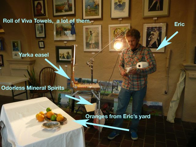
Eric Merrell. Well, I'm seeing him tomorrow so I'll just say that he is an awesome artists that builds his own frames and seems to have quite a calm and well tuned demeanor that I admire. It shall be interesting to know a bit more about him.

I also befriended Ezra Suko. A young artist recently back from Iraq where he was stationed. He already has three galleries representing him and is painting full time. Now that's the way to go. 

Some good news as well. I got a  big nice commission I'm working on and I became a signature member of LPAPA and I finished my series of classes at Willard Elementary as part of the "My Masterpiece" program of PSUD and the California Art Club.  That was a very satisfying experience. So not all is waste and wow-is-me.


In the meantime, I did paint. Here are some things that I produced. I scheduled a few shows locally and I'm keeping busy.

"Jacaranda Glow" 8"x10" Pasadena

Options:


"San Pedro Bluffs' 8"x10'
Options:


"Garden Gate" SOLD.


I've even decided I might need to start my own business with a friend. But that's also very preliminary so I won't talk about it. What I have decided is to make a Business Plan so that everything is taken into account as much as possible. And to stir things up a bit I am reading Leslie Saeta's 30 marketing ideas in 30 days  to get things moving. She is a slick operator Mrs. Saeta.

"Mauve Clouds" 8"x10"

The essential part is this: My art adventure is now real. Whether I fail or succeed is entirely up to me and what I am sharing in this blog now is "the thing", not tips, not digressions on composition and beauty. Like Voltaire's Candide, I'm over this being the best of possible worlds but I'm leaving Eldorado. (what did I just say about digressions?, I guess I can't help it.) BUT, the first thing I'll share is my new spanking business plan for everyone to tear apart. Keep you posted.

31 July 2011

A (computer) experiment.

Just recently I saw a wonderful show by Eric Merrell at Legacy Galley in Pasadena. Eric loves the desert in its starkest, most transcendental and distilled state. So taking advantage of a trip to Palm Desert, I decided to try to paint a desert scene. I approached it in my usual style, trying to capture the nuance and be as accurate as possible in color . When I got home, I got a glimpse at Eric's show brochure and realized my painting didn't quite "sing" like his. I was curious to see if by using a few Photoshop tricks I could recreate an Eric Merrell using my piece as a base. Now, before anybody says that no amount of computing could imitate the nuance and subtlety of Eric's art, I agree. I agree and I agree. I use Photoshop sometimes to check my levels (posterize and desaturate) but I never tried this kind of experiment.

First of all, any computing process can only alter color , contrast and other bidimensional qualities, never the volume and spirit of a brushtroke. Second, compositional and subject choices are also part of an artists arsenal and I didn't intend to recreate those elements. But I think my exercise could be a useful learning experience even ifI can't get to a perfect recreation.

So here it is , this is my painting  12"x16":


The first thing that occurred to me is that Eric's paintings have a lot more color. So I just applied a straight increase in saturation and obtained the following. It was surprising to see that more color didn't lead me in the direction I wanted. It's not about cleaner, purer  colors ....just yet.


On second thought I decided to apply an increase of contrast by using a curve operation where I brightened the higher tones and darkened the darks. Then, I desaturated the image a bit. What this did was create a more distinct distance between brights and darks and also made the colors closer to each other, retreating to the center of the color wheel and becoming grayer.


Then I applied a saturation increase and applied a palette filter to create less distinct edges and emulate Eric's softer paint application. I really enjoyed the result because it started to remind me of Eric's artwork a bit more. Most of the colors fall now in the "secondary" category, no pure yellows or blues or reds.


And of course my painting is no Merrell but I did re-learn  a few things:

A) A clean painting is not always about cleaner color or purer colors but colors that  are distinct  and relate better to each other. Whether  high key or high contrast, colors need to be parented to each other as equals.

B) Not to get too scientific but color tension can be created by applying a bit of knowledge on complementaries and paired colors.

20 March 2011

Eric Merrells demonstration

It was an unusually rainy stormy evening in San Gabriel, CA, when a group of people gathered to attend Eric Merrell's demonstration in the Glass Room Gallery of the San Gabriel Fine Arts Association.Eric is duly famous for his very sensitive use of color in landscapes. His work breathes color nuance and atmosphere without the burden of heavy detail or elaborate drawing. That doesn't mean there is not a lot of thought and method to his approach as we were about to see.


Originally scheduled to paint the mission outdoors, the heavy weather precluded any outing so he settled for a tray of oranges and an abalone shell. The lighting from outdoors was cool and grey. He only set up one single warm light he used both to paint and illuminate the still life.


Eric brought a Yarka type easel (with legs collapsible from the box). He used a single filbert brush for the whole demo. A very old brush from his times at Art Center -about ten years ago- which he dipped gingerly in a can of turp. No medium was used. The palette of color was very wide and the listing is posted in the picture below. His color brands were Utrecht and Gamblin mostly. He paints in luan boards, a wide denomination for inexpensive wood boards found in hardware stores and mostly used to "skin" doors. He applies a few coats of gesso and even applies canvas directly on the wood sometimes:


He makes a few marks to guide the composition. Then aims at a color area he thinks he can get down and makes his initial dabs. From this initial area, the painting grows in a contiguous march, spreading out slowly and deliberately. The reason for this methodology lies in the need to compare all colors with the adjacent ones. Eric squints constantly and compares each color to the whole for every step. His initial strokes are diluted but not runny. He is just skating the chromatic ground so to speak. I found this approach interesting as other painters like Calvin Liang and Clayton Beck emphasize color comparisons across the whole piece almost from the start. Choose what works for you I'd say.

Eric maintained a pretty clean palette all the way to filling up the board. Despite the fact that he didn't quite finish the piece, he was kind enough to demonstrate a more "finished" approach by really focusing in one single piece of fruit. It was very obvious that he wasn't looking at "fruit" anymore though, just masses of color and changes in hue . He really couldn't just "finish" one orange without retouching the surrounding colors. That is a mark of excellence.


There are many lessons in Eric's craft I find: Make your painting about something not some "thing". In Eric's case, it's all about the color. Trying to gather all the information in the world around you and place it in your canvas is a tall order. Trying to keep color theory in your head while painting -even as a colorist- can be tricky. Eric just tries to be as accurate as possible and sometimes , a lot of times, gorgeous color marriages occur. Painting is a "choosing". As a consequence there are no oranges of shells or trays but just color interactions, beautiful compositions or arousing light plays.