The world has shut down and plein air seems out of the question. At least for those of us who rely on public transport. Fortunately, there are plenty of exercises any artist worth his/her salt can and should perform while at home if circumstances permit. There's plenty of color charts to paint, materials to inventory, canvas to prime and some creative gymnastics to hone one's skill. Have you ever tried painting with your less abled hand? It is great way of ignoring detail. If ideas fail the internet is a source of spark like never before. Or commissions. Here is a picture I did for a house owner. It is painted from a photograph. Nothing new there.
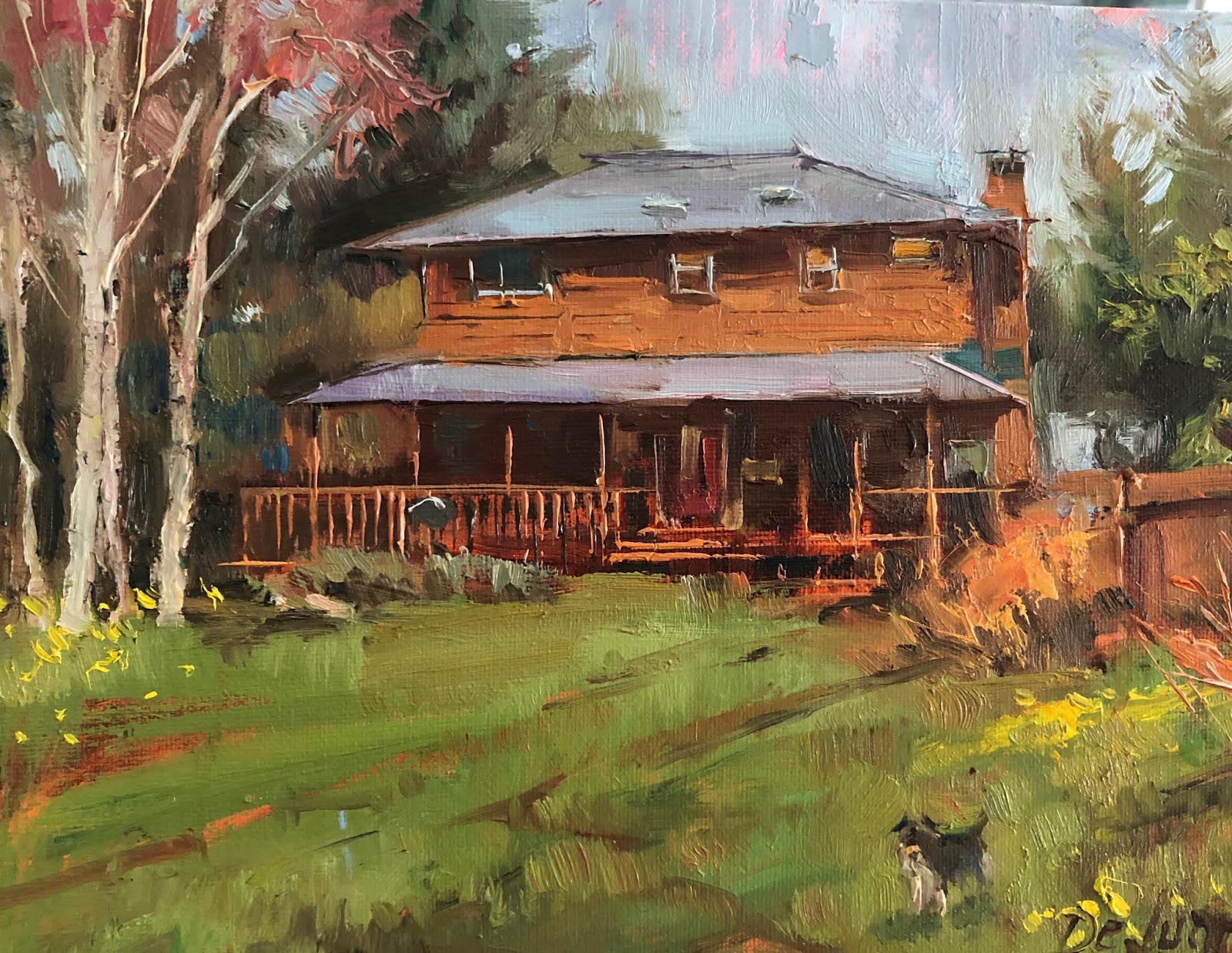 |
| "House with Schnauzer" 10"x8" oil . Commission. |
But then I had a commission that required a bit of head scratching. A client wants a view of Tower Bridge that has to fit a certain vertical format. I shall note I live in Vancouver, very very far from London. I shall also note Tower Bridge is better suited to a horizontal format if it is to be painted in full. I could just look at some pictures and copy them from my iPad while pretending to be outdoors. Nothing too hard. It requires to tinker with composition and such.
Now. The client also requested a certain mood: neither too gloomy nor too cheery. (they had looked at a former painting of mine) Here are a few sketches I did while pondering exactly how to approach this problem. The watercolor is too dramatic. The one where the morning sun illuminates the towers was deemed too happy or too blue. By the way, there was no picture with such morning lighting, I made it up. The sketch with the grey-purple tones approaches the mood we are looking for but I inadvertently have been making the towers taller than they are.... All these problems brought me to start thinking about the issue of "invention" of a scene.
 |
| watercolor study |
 |
| "Tower Bridge" 10"x8" oil on canvas sketch |
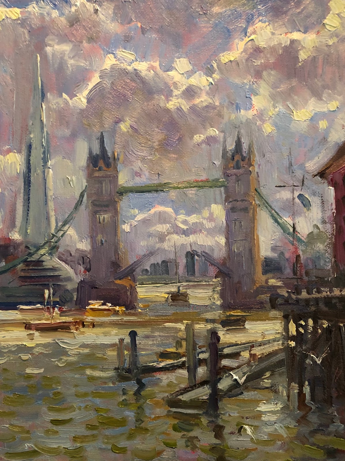 |
| "Tower Bridge" 10"x8" oil on canvas sketch |
Why would you want to invent? How do you go about designing a non-existent landscape? So I decided to tackle this problem the only way it could be tackled, by inventing and trying to paint a scene I have never seen. And make it look like it was painted in another time to boot. I have no idea why, may be I was talking about India to somebody, but I settled on a scene of the Gateway to India. It is another piece of victoriana architecture, which may also tie with the Tower Bridge roaming my head. In any case, that's what I decided, to channel my inner orientalist" and phantasize about a romantic Indian scene.
 |
| A picture of contemporary Mumbai. |
 |
| "Arriving in Mumbai" An invented scene on an 11"x14" canvas. |
So after finally succeeding on at least solving the color harmonizing issue, I think I'll explain the method here briefly. I cannot use the images from the artist himself so I will draw my own schemes to explain the way John Pototschnik goes about this. Since I can't use his lovely mixed OIL charts, I created quick references in water-colour to be able to explain the idea. Every artist should create its own charts to unleash the powerful deterrent against paintings that look like a salad by the addition of clashing colors where they are not intended to clash.
First: Tone always trumps color. Every color corresponds to a grayscale tone. Every painting has to work tonally before it can work as a color painting.
Second: The following palette schemes are orientative. Every color depends for its strength on the contiguous. So a brown can be considered either red or green depending on the colors that surround it. The colors left out are as important as those left in. The colors are intended to be premixed and then used as source colours with the addition of white to create tonal differences.
Third: The colors you choose as primaries are entirely your choice. My examples include a "warm palette and a cold palette. With have primaries but in one case they are warmer than the second palette. Warm palette includes "Cadmium Red, Cadmium Yellow and Ultramarine Blue" The Cold palette includes " Rose Madder, Cerulean Blue and Lemon Yellow".
So here are two color wheels. In one, I chose "warm" primaries and in the other "cool" ones.
A good palette should have primaries. All other colors are generated from those primaries unless you need a purity that is impossible to achieve by mixing. Violet is good example of a hard to achieve mix but not impossible. Again, my wheels are made with watercolor and are here for reference only.

Painting with all these colors at once is possible but harmonizing the painting with so many variables can be an ordeal. So here a first approach. Use only analogous colors. That is, colors that are in close proximity but represent a slice of the total wheel. I think Edwin Church's beautiful paintings are the pictorial equivalent of a musical scale and harmonize through an obvious but subtle use of an analogous palette

Analogous color palettes.
 |
| Edwin Church. "The Andes of Ecuador" |
 |
Complementary palettes. Other palettes might include cross shaped color mixes, that is a set of primary and complementary and two tertiaries (mixes of a primary and a secondary) . Or an isosceles triangle with one primary and two tertiaries around the complementary. This can result in very sophisticated color combinations. Notice in the two "orientalists" example paintings bellow how the richness of color barely resorts to striking primaries. There is a red in the first one and a blue in the second one but the rest of the piece relies on muted secondary and tertiary gorgeousness.  |
 |
| Henri Regnault. Water-colour. |
 |
| "Sand Storm" Ludwig hans Fischer. |
Here is an example that FAILS to harmonize. The colors are off. It might be the picture but there are warm and cold versions of every color and somehow the painting doesn't know where to direct our gaze as the green jar on the window sill competes with the hanging meat and the colourful robes against tehmuted ochre of the house entrance.


 |
| "Sorolla" "Walk in the beach" |
No comments:
Post a Comment