 |
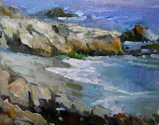
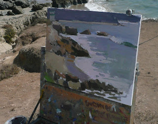
| Hey! I'm liking my progress. |
Day two rolls around and we are treated to a day in the sun with no respite or shade. Yet, we soldier on because we have to crank them out. I'll let you know that Ray's workshop involves painting lots and lots of boards. He did THREE demos each of the three days ! Plus at least two critiques per painting. Granted it takes him an average of 30 mins. for each demo ( the only breaks we get) but they are all a delight to watch.
 |
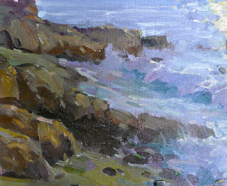
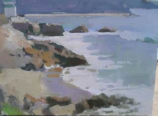
| Another one of my pieces. A very simple composition. But the sea is a bumpy moving mirror and after a while one sees all kinds of hues, colors and shapes. Who said this was relaxing? |
 |
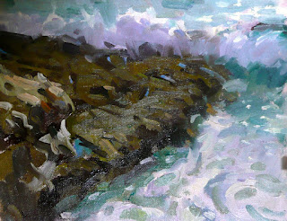
| Probably my least successful attempt. |
On the second day we honed in the same basic principles: design , organic shapes, color coding. Some new tips also. For example Ray demonstrated how to enhance the core shadow on rocks by adding a dark saturated color where the light turns to shadow. He also explained how to modulate a painting with atmospheric perspective through color. He said , for example, that yellow greens are the colors that first fade away with distance so foreground yellows should remain the most saturated an clean.
As for the mental state of painting, Ray said it has to be somewhat childlike. Children do not act driven by an "inner architect" that wants to organize the space and align things, they do have a natural ability to create interesting forms and designs and their intuition alone makes the avoid the pitfalls of static and boring.
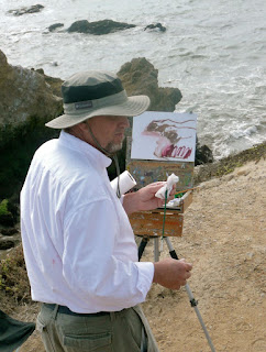 |
| Ray switching between left and right brain. |
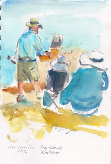 |
| A watercolor sketch i did of Ray teaching. |
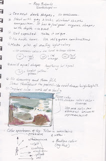  |
| Some friends asked me to post my notes. |
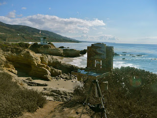 |
| Office with a view. |
One piece of advice of particularly liked: SQUINTING is a great tool not only because it eliminates detail but also because it amalgamates value and color relationships. Especially in a marine environment where color shifts are the norm rather than the exception, squinting gives a much clearer idea of what color things add up to. Watch out for blue colors, blue color make paintings colder and people respond better to warmth in color.
Why is it that a boldly composed painting looks more realistic than one where the details have been painstakingly carved out? To sum it up: A stylized pattern makes the artwork look more real than a faithful rendering. Stylize to make your artwork look more real. By stylization we mean the crafted design that engages the eye and the color application that respects the values, belongs to a clear element in the composition and is as accurate as possible, you can push it a bit as well.
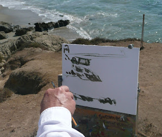 |
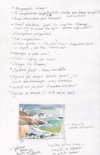
| Ray composes an atmospheric piece or a wide view. . First the dark shapes |
 |
| Avoiding repetition , tangents and symmetry. |
 |
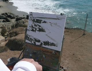
| The hills in the back are added in as a block. |
 |
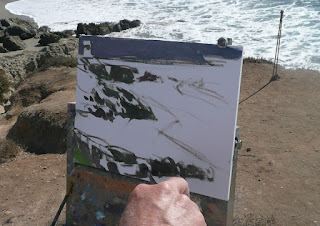
| In comes the white foamy water, now with a milky hue. |
 |
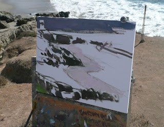
| Everything has its color code and its design. |
 |
| The resolved sketch. |


4 comments:
Note: "Connect dark shapes. No medium ." Juan, I assume, from your note that Ray doesn't use turp or medium. Is that an accurate assumption? Brings to mind a quote: "Oil paint needs only to be thinned by the vigour of its application" Walter Sickert
Don't recall your seascapes, but it does appear that you are applying Ray's instructions with great success.
These are more great details- thanks!
Good point William. Yes, Ray uses no medium outdoors and he referred several times to connecting the darks even though I think that is more a way of drawing the initial "flow" than an actual need. He sometime painted separate darks like in the demo I posted above.
I always love reading your "take" on workshops and demos. You are so articulate and clear.
It was good seeing you there, Jose!! A great day, wasn't it?
Post a Comment