I decided to take a half day workshop with Frank Eber at the Art expo in Pasadena. I am quite wary of these types of workshops because they usually are just means to push some brands unto the participants. Moreover, this particular Art Expo doesn't have enough vendors and sponsors to really grant a visit and purchase art materials at a discount.
However, the name of Frank caught my eye because I had seen some of his watercolors in San Clemente Plein Air and I thought his art reminded me a bit of Alvaro Castagnet and Joseph Zbukvic. There was more of a method to his paintings though so I figure it would be interesting to check his workshop out.
Here are some examples of his artwork:


Frank Eber is sponsored by Daniel Smith watercolors. Here is the palette he was sponsored with.

Frank Eber watercolors are moody and crisp.


So here is his setup. A simple table easel. A metal palette with his colors distributed between a warm zone and a cold zone. He uses Arches paper , 140 lbs. Usually half sheets.


Franks principles are few but solid. Mostly he emphasizes that TONE is the most important element by far. He quoted another artist (whose name I forget): "Colors get all the credit but tone does all the work."
In essence, color mixes do not matter as much as keeping warm and cold color temperature and thinking in terms of tone and temperature. The colors used in a painting are very few most times and Frank uses a "dominant" color throughout.
As far as layering the watercolor, "it's about the right amount of water, the right amount of pigment, at the right moment, with the right brush." Of course that takes ages to master. The main goal is to create a mood. To that end, after creating an outline of the drawing, Frank creates a wash layer, a very simple wash with some paper white reserved for things like rooftops, windshields or people.


 |
| Initial wash. Notice the deeper pigment in the foreground. |
This workshop in particular was about painting an urban landscape so he distributed his big blocks of building masses first , using thicker pigment for the closest structures, being mindful of the areas and edges we had reserved.
 |
| My attempt at a wash. |

 |
| Connected shapes and big shape washes. Observe the density of pigment at the base of the buildings and the connected shapes of the cars and buildings. |
The watercolor process was really quick in itself . Frank let the car, tree and people details for the very end, carefully delineating their shapes sometimes, "messing them up" a bit others by creating water splatters or dragging the brush to generate interesting designs. . It is easy to see in his watercolor that the roughly textured paper leaves some sparkle and allows for interesting dry brush work. He also taught us some tricks regarding car , people and building rendering.
 |
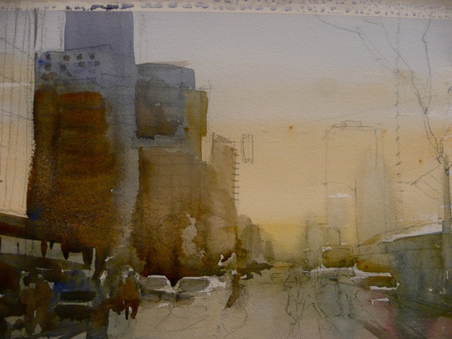
| Frank Eber's finalized demo piece. |
5 comments:
Gorgeous! Very inspiring.
Happy Painting,
Nora
It's nice to read about your workshop experience. I'm a big fan of Frank Eber's work. I can't make out all the names of the colors on the photo with the tubes. Can you tell me what they were.
Thanks
Daniel Smith colors. it seems I can make out Carmine, Cadmium red, Yellow Ochre (?), Cadmium yellow, Quinacridone (?) , Cobalt Blue, Cobalt Turqoise, Ultramarine
The last one appears to be Utramarine Violet.
The last tube on the lower right appears to read Ultramarine Violet. Frank does sometimes use a dark neutral violet or blue.
Post a Comment