13 December 2015

The value of place. Work in winter.

'Brixton' 8"x10" oil on canvas board
Another year draws to a close and I can't shake thinking there is a parallel universe where I am making a living as an artist,  painting that is . From time to time I catch myself thinking things like 'Right about now I would be getting into portraiture' or 'What would happen if someone commissioned a mural? ' People always say I must feel fortunate but I don't because along with a modicum of talent, an artist must must must have an entrepreneurial risk-loving nature that I do not possess. It's a ballsy thing to be a professional artist.  I despise self-pity and yet, here I am. Full of it. 
So before I dig myself deeper let's switch to the good stuff, what have I learnt from landing my sorry self on these parts with their different kind of  weather and light. A sense of place. 


'Horse Guards Rd" 8"x10' oil on canvas
 A sense of place is important to me right now may because as a two-time immigrant, I am sick and tired of travel for work (no, not the leisure kind, that one is fun.) 

My palette has changed.  I have noticed Emerald Green creeping out of its shell a and making it into the walls of brick buildings while that lazy painter's friend, Mr. Sap Green, hasn't been seen for months.  Then Ivory Black slipped into  my box and I found myself often  reaching out for Payne's Grey in my watercolor set. Lemon yellow with its cool acid whisper seems to be gaining over hearty ol'  Cadmium. Alizarin camps on my skies instead of the brighter Indian Yellow of sunnier days. Ocher with its perfect grey tonal value buttresses many a passage. Some colors have even morphed into something else: I recall the days when Transparent Oxide Browns were my go-to for  creating transparent shadows and undefined corners. These days it just  lends its warmth to different flavors of gray.  In short, I am finally painting London.

'Knightsbridge' 8"x10' oil on canvas
 My few successes capturing  the luminosity of California were hard earned. I came to London  a bit apprehensive that I wouldn't find the landscape stimulating enough, that I had worked so hard at creating vibrant color and vivid light  just to see it discarded. But once in England clouds showed up with their incredible variety ...and then  it started raining.  I knew right away my fears were misplaced.  That was painting gold right there along with muscular trees, softer light and lots of interesting people and endless bouts of  the flu. So I carried on adjusting and adjusting to my new surroundings, letting the palette build itself.

 Other things started to happen besides the pigments reshuffle. In the bright Los Angeles light, I favored describing the volumes through saturated contrast often letting either the light or the shadow carry the weight of detail but never both. I'd let the  shade be transparent  and act as a breathing space while the sun-drenched areas lived apart letting the magic happen in the borders between light and shadow. Under the British light, the local colors become explicit, matter-of-fact, shade is a question of gradations and shape is described by a continuum of edges and transitions. 

'Harrods at Night" 8'x10' oil on canvas
 I've also learned quite a bit by observing what the native artists do. True, nowadays most art is universal, techniques could be a matter of taste rather than one of location but visiting some of the shows at The Mall galleries (a good place to see proper painting without any sad claims to be 'questioning issues of social transcendence, gender roles or inner turmoil ' or any such nonsense)   I have always been struck by the air of 'family' the art emanates. And not only because British artist overwhelmingly favor soft bright colored frames instead of dark or gold. It's hard to put the finger on one thing and I've mentioned this before but British art has a thing for accuracy and another thing for proper draftsmanship that is quite refreshing. On the other hand, a lot of the art lives in a low saturation content spectrum, aka a certain 'chalkiness', as if the painting hasn't left behind the reliance on the drawing. 


'Tottenham Ct' 12"x10" oil on canvas

'Whitechapel' 10"x8" oil on board.


  When I was about 19 years old, I used to think the Flemish masters like  Van Eyck,  Memling, etc.. were just odd fastidious painters with a very particular taste for thin trees, sad skies and  fish-eyed pale subjects. Then I traveled to Belgium  and I was shocked, shocked! that the landscape and the people looked exactly like the Flemish portraits I had studied in school.  The poplars were thin, the  skies and the streets of Brussels awash with cool light and pale alabaster people. Turns out the Flemish masters fitted right in and had been faithful to a fault. 

Paintings match the environment. It is logical of course. And it is a sign of a great talent that one might recognize the light from the flat application of pigments. Think  of  a  California Impressionists like Rose or Puhuff  versus a Wyeth or Hopper. Even within environments: I can see the candlelit nocturnal Rome in Caravaggio versus  the diaphanous Tuscan softness of Raphael.  Even cosmopolitan Sargent who traveled the world so  much and yet only seemed to able to capture the color of money... (I'm joking!). 

Now if I can only stay put in one place so that I can travel. That would be the bee's knees.  


27 September 2015

Where there's a will there's an Ai Wei Wei at the Royal Academy.

Entrance to the Royal Academy. Trees assembled from fragments by Ai Wei Wei.
 European and American artist have been loosing 'street-cred' for decades now, their protests more akin to a pout than a call to arms  Thanks to the likes of Tracy Emin,  Damien  Hirst and other luminaries, the whole art-as-commerce or art-as-selfie thing is as stale and bloated as it is fodder for tabloids. Look at Bansky, already fetching high sums at auction,  his graffiti  no more than  a highly choreographed event or a gift-shop staple.  We can go on and on with the list of artists desperate for a cause, itching for a fight or too keen on having their doodles printed on a necktie.

So, as a consequence,  the art world cabals have searched high and low to find someone that can replace their darlings.

Because art can't just simply be beautiful - I am aware that is another form of political statement so spare me-  its 'content'  has to be explained  through politics or personal tragedy, or something along those lines.  I am not saying depression,  domestic violence or the measles are not serious. I am not denying capitalism as we suffer it is a  true competitive arena subject to fair equitable rules. Far from it. But it helps when there is, in fact,  a government that beats you up,  puts you under surveillance and messes things up for you in various violent, dumb and uncreative ways. Walk in Ai Wei Wei, The People's Party is your bitch.
From S.A.C.R.E.D. a huge diorama depicting episodes of  his ordeal

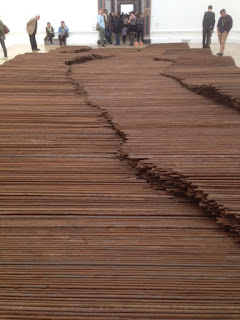
The Chinese government has fucked up this man's life into the stratosphere ...of fame.  If anything, the exhibition at The Royal Academy demonstrates the amount of money and manpower  that Ai WeiWei can summon with a simple maxim in his famously sparse grunting.  He is a star and despite my diatribe, let me hurry to point out I loved the exhibition. More for the questions if creates than for the artwork itself. I even got tears in my eyes when confronted to the rebar pieces of "Straight", a massive 90 ton installation honoring the victims of the Seichuan earthquake and condemning the greed, corruption and  the criminal ineptitude of Chinese officials.

Ai WeiWei is a charismatic man, no doubt. When he ventured into New York as a younger man he really -really- absorbed the trends and ideas reigning in the Western art world. In a way, he has been doing what most  Saatchi pet wannabes and suck-ups  have been dreaming of for years. With a crew of skilful craftsmen no less.
"Stroller" carved in marble.


May be that is why so many of his pieces are accumulations:  3,000 porcelain crabs, 60 hand-chiseled marble pieces of grass, thousands of painstakingly straightened rebar pieces, etc... If you have been to an art gallery recently, it is very likely that you have experienced this tendency to pile up crap and then conjure a meaning: "Oh, my dad used to hit me with the slippers so here, a million slippers in a pile". Ai WeiWei does that. But he does it well, as if to preclude any more lame strewn piles of shit in the future. If you've seen one of Ai Wei Wei's gatherings of rubble, you will never find time for  another mindless heap of tuna cans or human hair balls  in your life.

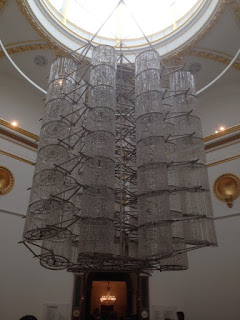
"Chandelier' Glass and bycicle frames.


More interesting is the use -obsession really-  of recycling Quing dynasty furniture or rubble from China's destroyed past into a new life using armies of craftsmen. (How does he pay them? I wonder. In fact, how does he make money?)  Some of this recycling has been controversial as in his deliberate destruction of a Quing dynasty vase and the pulverization of neolithic ceramics into fine dust. I can come up with many different explanations for this acts, all very satisfying, but they all hurt a bit despite it all. Mostly it comes down to a lot more people aware of that shattered vase now than ever before.

Quing Dinasty Stools re-assembled.
May be his most successful dare -in my view- is the  chiseling and conjoining  of beautiful objects rendered useless. Ai WeiWei is Chinese through and through and the idea of beautiful uselessness is pervasive as in the stroller delicately carved in marble, the jade sex toys, the delicate porcelain human remains or the oddly assembled  antique furniture. The overwhelming impression is that of a man in an enormous factory with thousands of workers at his disposal dreaming up his poetic artworks because, to me, they are closer to poetry than to the visual arts. And with his poetry I have no qualms. However, it still feels a bit suspicious that such a persecuted man could muster this power in the land where the powers that be want him quiet. Could the PP really abide by popular opinion to such a large degree? As I said, more questions...


"Straight" rebar pieces recovered from Sichuan buildings destroyed in 2008


24 July 2015

Tattoos and Mr. Lopez. The BP Portrait Awards 2015.

'Sebastian' oil on canvas , by Czech painter  Jan Mikulka. 70x100cm

 Today was a very rainy day here in London. So after running a few errands I was on my way to make a few gallery visits. We visited the White Cube in Bermondsey with it's usual collection of massive art where the only mystery is how do they move it around and how much did it cost to build. Took us all of five minutes so back in the rain we went. Our last stop was at the BP Portrait Award  show currently displayed at the National Portrait Gallery. One thing I really like about this show is that it takes chances and  it selects a great variety of styles within a strict definition of painting. Moreover, it doesn't shun figurative artwork or traditional skill. What are they thinking!?

Like last year, why the first prize went to the painting it went to will remain a mystery to me. I thought it was a-ok, a bit uneven, miming photography and uninteresting despite the pretense that it was inspired by a biblical passage or something lofty like that. Oh well.

 My favorite piece was the beautiful portrait of a man in the forest by Jan Mikulka, pictured above. The visitors consistently vote him as a favorite but no prize this year. I think he already won one in a previous edition.

The second prize was the stunner below, very Dutch, timeless. Quite beautiful and executed with the precision required when one attempts to go for it and make things hyper-realistic... or bust. Moreover, it doesn't have the tired rendering of every nook and cranny so typical of hyper-realistic paintings, it leaves room to breathe despite accounting for every hair. 

 
 ' Eliza' by Michael Gaskell (b.1973)   370 x 270mm, acrylic on board. 2nd Prize.


"My mother and my brother on a Sunday evening". Borja Buces Renard (b. 1978) oil on canvas, 1500x2000mm
Every year there has been an increased presence of Spanish artists and some of them are excellent so it is quite natural that the Third Prize went to the one pictured above. It wasn't my favorite painting of the 'Spanish group', to give it a name, but it had nice dissolving edges and directness.

And now for the rant: Why so many portraits with tattoos? No, not that one. 

It seems to me that the abundant presence of Spanish painters and the clear ambition of many of their canvases indicates a lack, rather than an abundance, of venues and conduits in my native country. These painters are here in London because Madrid and Barcelona and every other town in between must  not be offering the market and the livelihood some of these artists would want and aspire to. Where is the Spanish National Portrait Gallery? Where are the monetary awards? True, Spain is going through a Greek-like financial debacle right now. Can it be that simple? I suppose it can but shouldn't there be  more Italians or Greeks as well?.

 It is great that these artists are seeking international exposure. Being myself a product of an art school in Madrid, either these gals and guys must have put great effort into surmounting the dismal quality of art schooling in Spain  or the schools have changed dramatically.  May be they were left with the only option: To look  at the masters they had around, quixotic as that may be. Except  in this case they all happened to pick the same one.

It's quite clear that the shadow of Antonio López looms large in current Spanish figurative painting, may be too large. Invariably, all the portraits from Spain had that bleak,  underwear-and-socks, asylum lighting and morbid look that López mastered. Don't get me wrong, I love love love Antonio López and he is himself following a  tradition of austere and matter-of-fact art that is oh-so-very Spanish but the portraits here presented could almost be authored interchangeably. That doesn't make them bad but it is hard to believe that some of these artists are really looking for a unique voice. Take a a look:

"Natalia" Jorge Abad-Jaime De Aragón. (oil on canvas)
"The Red Chair" Maria Carbonell. (b. 1980) oil on canvas.

"Back Portrait n8" Daniel Coves. Oil on canvas.
"Juanito" Jose Luis Corella.  Oil on board.

"Rocío, desnudo sobre alfombra" Eduardo Millán (oil on canvas)


Odd, isn't it ? They are not even from the same city and yet they all share an uncanny family resemblance. Of all the Spanish paintings, my favorite without a doubt had to be this one. There were many worthy pictures to be seen here and, as a visitor, you won't leave without some nifty ideas about where to place your next tattoo.


10 May 2015

Underground sketching, drawing at full speed.

Commuting in the underground is not always wonderful. It beats driving any day however. At the very least it is a chance to spend some time with yourself (granted, a very squeezed yourself enveloped in humanity with all that implies). I actually have come to look forward to the trip because I can sketch the immense diversity of London types. For anyone that wants to emulate this activity, here are some things I find useful:


Often, I add some marker shading at home, not in the train.

You will find a wide array of models to choose from in the tube: young, old, well dressed  or messy, black and white and everything in between. While there is a lot of variety, most people spend their trip staring at their phones which makes for strikingly similar demeanor.

The page format is irrelevant but it should be comfortable to carry discreetly.
Eye-contact in the London tube is tantamount to assault so I try to chose someone to draw who is not too close or  directly in front of me -no matter how tempting the beautiful guy with the turban might be. I haven't gotten into any serious trouble but I've had the occasional gal deliberately turn away and the random guy give me dirty looks. If the subject is a child,parents might  or might not like you  doodling. The London crowd is a vocal crowd so you'll know. For the most part, people are complimentary and curious. When drunk, they invariably want you to draw them so avoid drunks like the plague.


If tsubjects stay long enough, you can make elaborate compositions.
It goes without saying, there is no telling when your model will  move or simply bolt out with no regard for your beautiful rendering. Don't linger, this is an exercise in speed, gesture and memory. As in life, nobody is too precious and they all are.

so many races and outfits. So many cellphones and earphones as well.

Guess what else moves. The train. Modern trains are a whisper but drawing in the Bakerloo line will test your limits so don't wait for full careening down the tunnel to add that perfect nose line. This might be the time to work on a particularly wiry afro for example.

The morning commute, not a good time to pull out the pencils.

Weekends and evenings have more variety anyway.

Snoring, kissing, reading, eating and breaking into song, all in the tube.
Equipment simplicity: This is not the place to  pull out an easel and take measurements with extended arm. Backpacks and clipping boards are not efficient. A simple pencil box and a notebook that fits in your pocket are best. That's it, quick and to the point. Add an eraser and pencil sharpener for emergencies.
Stations themselves have some unique features and depth.


 You learn to draw the figure through gesture, its pose and the pose of clothes. You also learn to reduce the figure to its most salient features and details without time for perfect outlines, shading or intricate skirt patterns. I try to make little portraits, not generic ones. A casual observer should be able to pick each character individually.  You'll discover that being selective with detail is much more important than adding every detail.

so many faces, so little time.

Don't sweat the wrong stuff.  Go for the next victim...er model.


Compose the page. Make the whole page look interesting to look at. This is actually fun. Leave some blank space, play with negative shapes, use contrasting figures and groups. Incorporate a bit of the environment if it helps to break the monotony or move from faces to feet to dogs  to suitcases. 


More than anything, tell a story, be tender, humorous, grotesque, nobody is paying you, so feel free to add, subtract and exaggerate. Give in to your inner cartoonist (carefully) or your inner novelist. Make notes, add stains, you are making art no documenting immigrants or taking the census. Have fun.
Can you find the dog? 


09 May 2015

Our day of hero worship: Alexander McQueen and Singer Sargent.

Victoria & Albert Courtyard. watercolor

Today we decided to visit the spectacular Alexander McQueen exhibition at the Victoria&Albert Museum:"Savage Beauty". This is without a doubt the exhibition of the year in London where it returned after a successful run at the Met in New York. Ever since museums discovered fashion sells tickets, they have had a field day ordering mannequins and displaying the likes of Gaultier, Yves St Laurent, Vivienne Westwood and many others. Fashion allows for theatrical displays, multimedia madness and colourful crowds.

I like fashion, I think it's cool but it  doesn't keep  me awake at night.  I certainly subscribe to the idea that 99% of it is either bonkers, or just silly. In short, I didn't expect an impact. It did actually have one but  not because of McQueen's tragic death or anything particularly deep about the guy. It was just very well done. As a matter of fact the least theatrical of all rooms, the second, was the one that got my wheels whirring. These are my impressions about the show and the clothes themselves:

Very briefly, the exhibit follows a chronological scheme with every new room evoking the environment of McQueens' work and runway spaces at that stage of his career. The first room, for example, displays the low budget designs of a young taxi driver's son with lots of creativity. The environment is industrial-warehouse and the soundtrack -yes, fashion shows have soundtracks- is that of a muffled rave. His designs are inspired by the street, the club-scene, movies and very much by London. McQueen's work shows consistency from his very first stitch not only formally but also from a narrative point of view. He is very much an English designer down to his fetishism of birds, Hitchcock anyone?

The second room shows his MA project as well as his apprenticeship work in Savile Rd. and other places including a workshop that made uniforms. Flawless tailoring takes over. McQueen proves here that to break the rules, you need to know them. The construction of the suits and dresses is original, playful, almost like origami in some cases...one can sense the confidence of a craft well absorbed and ready for the jump into art.


 So what's a young gay guy to do with all that power under his scissors. The next room is invaded by romanticism and Gothic influences, it's operatic and baroque, barely edited.There is a sexuality and a power to it no doubt but except for a few details and signature forms, it seems it all has been done before. I like that he is deliberate in his avoidance of women and girls as naive or soft. These are some dark queens,  full of armor and sharp edges while wonderfully feminine. He accelerates the appropriation of elements from other arts with prints, plumage and embroidery .


Then begins a series of juxtapositions, the first one being the natural world versus man. McQueen seems to have had a very keen sense of the fragility of life and its savagery. The environment is cavernous and simulates a crypt made of bones and skulls.  I believe along with  the curators that London is essentially where this idea of the fragility and combat of life is materialized. It's an anarchic place at its core. The design becomes bold and tribal. The materials start to expand into the unheard: hair, horns, skulls,polyester. Had he lived longer, McQueen would surely have won an Oscar at some point.
"As a place of inspiration, Britain is the best in the world. You are inspired by the anarchy in the country"

With the next rooms, we are definitely in the presence of a master designer. He draws inspiration from his Scottish roots to create the "Widows of Culloden" and the show forcefully pairs the seductive tartans against the fairytale designs of "The girl that lived in a tree" (2008) collection which is inspired by Victorian and romantic English designs. I have no doubt that McQueen felt and loved his Scottish heritage very deeply and that he created a sort of indictment of ancient genocides. However, anybody that thinks for a minute that 'fashion cares' is delusional. Even the designer himself was aware of the inherent contradiction of creating excess while advocating a return to less consumerism, luxury while using cheap materials and so on.  From here on, AMQ seems to be "in search of a cause" but it is mostly just a thin thread to hold together his own ideas avalanche.


As if aware of the risk of a flood of photographers (and sketchers) or worse, selfie-stick holders, snapping pics is strictly forbidden. The guards enforcing this rule are polite but unlike  in any other exhibits, they are not distracted students or bored to tears matrons. These are tall strapping hawks. Hence no pics. Well, one. My husband has seen the show three times already -thanks god for that V&A membership! and he won't be deterred.

The middle room is amazingly built as a giant curio cabinet holding hats, corsets, bonnets and all kinds of magnificent shoes  and jewelry. Here we see the collaboration between AMQ and other designers of accessories like milliner Phillip Tracey or jewel designer Shauna Leane. He teamed up with an ever increasing set of trades like taxidermists, wood carvers and even 3d printers (is that a job yet?) The designs in this room put to shame most contemporary artists and sculptors, each one a   tastefully displayed piece, a masterwork in its own right.Videos of his runway parades are projected now full throttle. I think my favorite piece must have been a top made entirely of mussel shells. The idea alone is much better than the result but when you learn to appreciate the jasper beauty of a humble mussel, well , I sympathize with a designer that wants you to wear it. I liked it better than the coral peacock and the bird of paradise - the whole bird- bonnet owned by some countess Bismark or other.


In the middle of the cabinet of curiosities room, a dress spray painted by robots.  In the next room, a holographic Kate Moss frolics midair in her billowing wedding dress like a mermaid in a dark and pyramidal fishbowl.


 The next few rooms are dedicated to his take on the Western versus Eastern styles with some breathtaking kimonos and surprising combination of what by now are McQueen signature ingredients: powerful shoulder pads, elongated bodies by means of lowering the waistlines to the upper thighs, shrouded shoulders, swollen hips, magnificent hats and shoes, etc.. . If you are in London, the Tate gallery is simultaneously  exhibiting some photographs on the creation of his "Horn of Plenty" show. It's worth taking a look (and you can take a peek at Tracy Emin's putrid bed  and draw your own conclusions about art, life and depression as a creative force, or something.


The exhibit draws to a conclusion with the last show before his untimely death - he hanged himself  and let's face it, he must have been exhausted living in "his" world and allowed to roam it. "Plato's Atlantis" is about a world submerged by global warming where apparently we have evolved into incredibly chic survivors, drowned but stylish nevertheless. His animal prints and slick designs seem a lot more wearable all of a sudden. His shapes seem to arrive at a resting state, much more edited, hinted.
In conclusion: A show any artist of any discipline would enjoy. A temple to appropriately worship at the (silly or not, your choice) altar of fashion and romantic notions of genius. There is no doubt in my mind that MacQueen was an artist and I took that with me. The rest is frothing, oohing and aahing about how AMQ was "deep" and  general celebitching . Go see it.

On a side note. Another concurrent show at the V&A is called "What is luxury". It was interesting as dessert to reflect on McQueen and the relevance of the superficial, unique, precise and just plain expensive. Here is a lamp made of tiny bronze wires and dandelion seed heads harvested before their dispersion and assembled together with the addition of tiny lights that require a sort of wireless wiring to glow. Fancy. The conclusion of the show seemed to be that the real luxury of our times is TIME itself. Couldn't agree more.


Since we were in Chelsea and we were not done celebrating art deities, we decided to get to know that neighborhood in London where summer is a verb, Chelsea and pay a visit/stalk Mr. Sargent's ghost. Chelsea is lovely, a little bubble of everything-is-right-with-the-world. We moxie'd over to see the old digs and studio of boy-genius J.S. Sargent this time. His house on 31-33 Tite St., a stone's throw from the Thames, was surrounded by scaffolding except for number 31. This was the studio. Sargent bought number 33 as his residence but also bought 31 to create his workspace  and he labored here for 25 years until his death.  The street has blue plaques galore including Oscar Wilde's. So I leave this post with me looking smug and fat at Mr. Sargent's door.

31 Tite Street. Sargen'ts studio.


07 May 2015

William Morris, The Avengers and collective art.

This entry is a rambling reflection on the nature of "collective art" -not to be confused with "art collectives", very different and a whole bundle of separate trouble-. It was prompted by a visit to one of the museums dedicated to William Morris in London, a trip to the multiplex to watch that visual effects mishmash that is "Avengers, Age of Ultron" and some troubles I had with my contract back in February. I'll throw in the recent experiment that the Dulwich Gallery conducted in which they hid a Chinese-made reproduction  of a Fragonard original and asked patrons to find the copy in the museum among all the other paintings. Only 11% recognized the copy as such!
WilliamMorris Museum, Walthamstow. watercolor
It is sort of a given that an artist has a vision, a signature or style that is unique and can't be reproduced. This notion wasn't always widely accepted. For centuries, artists toiled as anonymous craftsmen conforming to a model and only rarely stepping out out to be "original". Artists created wondrous cathedrals and beautiful scrolls after lengthy apprenticeships and many years of imitative practice. Only during the Renaissance did we start to seek individual uniqueness in Western art. The fever pitch of artistic exceptionalism occurred during the Romantic period when grabbing a pen or brush with some merit transformed poets and painters into divine lightning rods. It was also at this time that craft gave way to individual expression as the most sought out characteristic in a work of art. We are still suffering the aftermath of that. No artist  can be satisfied today if something doesn't have his/her personal touch. A craftsman might enjoy and be rightfully proud of a well made shoe but wherever the word "art" is uttered, we expect to see something distinct, not just a well made product.

St Cecilia stained glass window. W. Morris workshop.
Being a computer artist by day (and a desperate artist by night and on weekends), i couldn't help but notice the similarities between the computer graphics artists of today and the medieval manuscript illustrators or Morris weavers and printers of yesteryear. CG artists, like their more traditional counterparts, have a client to satisfy, deadlines and quality controls. As any traditional artist should do, they breathe their craft day and night. Even those whose job is to replicate photo-real images or follow the art director's commands to the letter are bona-fide artists constantly being diminished by people who think computers do all the work ...which is like saying Word Perfect wrote the Harry Potter books and some recent legislation. And yet, he final product is as anonymous as the lengthy list of credits at the end,  that wall to the fallen that scrolls on the screen at full speed  and  where noone can find their name. The personality in movies is better left to the actors and the directors and that's fine.


On a side note: I've grown wary of producers and other "visionaries"  filling their mouths with the word "artist" to address overworked employees and animators. It is a cheap means of flattery. It comes attached to implicit demands for shorter deadlines and weekend work . It challenges employees to live up to their calling and shut up because a "true artist" would demand nothing but relentless devotion to the project beyond any  concerns for family or health.

If they ever  use  the term "family" to address their crew, then it's time to head running for the doors. Family members don't get laid off.
Artwork for Avengers, by ILM. Beautiful imagery in a really dumb movie.


May be this is why it is sometimes difficult to find satisfaction in a job that demands a well crafted product, not necessarily a personal one. There are many , many, similar or worse jobs out there but as someone trying to interact with the world as an artist, "well made" or "technically proficient" might not be enough. I know I'll get in trouble for this but in some cases it might not even be necessary. Programmers and technicians, on the other hand, can develop their creativity to their full potential making cg movies because their "product" is rarely the film itself but the technical achievement that made it possible. The film itself could be two hours of beautifully simulated liquids and flying debris and that would be great. Wait, isn't that what we normally get? I'll admit personal limitations play a role in this as well when trying to reach artistic goals. .

It is possible that the artists and craftsmen employed by William Morris felt the same way. W.M. was an utterly interesting socialist and artist who advocated a return to craft and simplicity and whose clients were invariably wealthy since they were the only ones able to afford his designs. His friend Burne-Jones contributed numerous designs that were transformed into tapestries, tiles and stained glass. But his workers might not have been the happiest bunch even though they were not too bad off compared with other workers inhaling fumes and cotton dust in Victorian London. Their products were glorious but did they think of themselves as artists? Did it matter? Self-realization is a recent phenomenon after all.


William Morris bust

I wonder if the Chinese copyist that painted the oil commissioned by the Dulwich gallery to entice patrons to test their nose for fakes (attendance increased four fold during the challenge) felt any artistic satisfaction beyond the production of a decent copy. Seeing the two pieces side by side, it is obvious the Chinese piece lacks a lot of the subtle transparencies and mystery of the original. Yet only 1 in every ten visitors found the fake among all the paintings in the gallery. 3 out every 100 though a portrait of a lady by Rubens was the fake piece shuffled among the priceless artworks.


The true Fragonard.

Chinese copy commissioned by the gallery from a company that mass produces such copies.

Two observers compare the copy and the original now placed side by side.

Does a weaver have time or even want to weave a single napkin for himself after 9 hours at the loom? My conclusion because I need to make up one is that for any artistic satisfaction to occur, most effort should be poured into that napkin, personal projects of any kind, no matter how small or unmarketable , drawings, photos, animated shorts, models.. I should have followed that advice myself in regards to my own career. Even when studios stipulate in their contracts that they own every dream and doodle, nobody gets paid enough to give away the art they create outside work, their mark in the world.