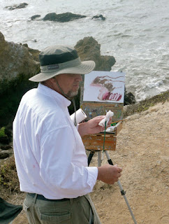
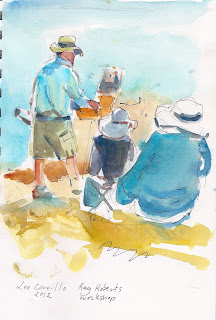
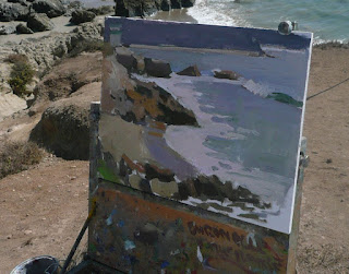
I have been looking forward to take a workshop with master Ray Roberts for a long time. So when I found out he was giving one in Malibu I signed up right then and there. Ray Roberts, in my opinion, is one of the best landscapes painters alive and we are lucky that he teaches.
While I talk about his workshop on this blog, there is no substitute to taking it and seeing him work. So I consider this post mostly as a record for myself.
 |
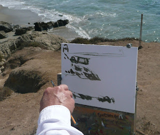
| My first exercise after Ray's demo. Already things happening. |
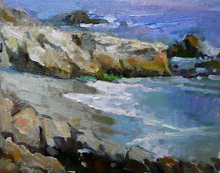
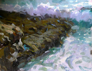
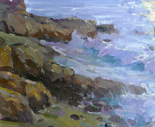
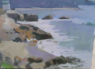
Ray Roberts paints "sketches" in plein air, sometimes up to ten a day. He paints them very quickly but not rushed and doesn't consider them finished paintings but just reference for larger pieces. If a sketch looks good, Ray suggests it might make a good larger piece . They are used for color reference. Along with photographs and video -yes, video is used to freeze frame for example a wave in mid-explosion- they constitute the basis for larger paintings.
 |
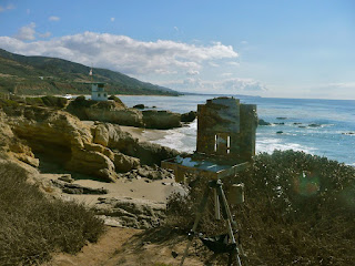
| Reductio ad minimum. Small pochade , few brushes, simpled gessoed card or plywood. |
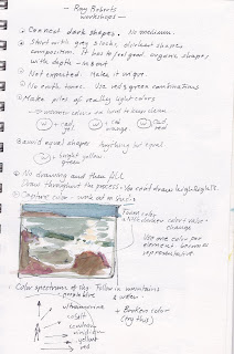
Ray's palette is not necessarily fixed. Some interesting things about it: It's already spread out . There are no earth tones, Ray likes to mix reds and greens to create those. Because it's hard to keep them clean, Ray pre-mixes three small piles for highlights. White PLUS yellow, orange and red. Sometimes he also premixes some phtalo yellow green.
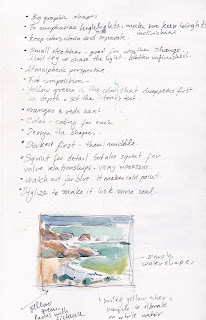
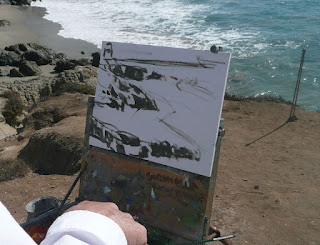
Ray looks for a simple statement and composition. Nothing is detailed. He usually would start by mixing a neutral color and creating the main shapes. Dark shapes first and then moving on to the other main blocks of color. He is very conscious of design and composition at this stage. One thing he emphasizes is the creation of an interesting design: no symmetries, repetitive forms, similar spaces.... I personally thought this was not a problem for me until I started working and he critiqued. What a battle it turned out to be and what a lesson. Only for the trouble I had, the workshop was worth its price several times over.
 |
| Starting the sketch with some bold neutral shapes and darks. Already design decisions are made. |
 |
| Premixing for highlights. |
 |
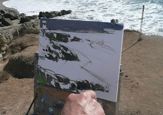
| Deciding where the wave should go. |
Drawing, according to Ray, is an ongoing process. To draw and then "fill in" the forms creates stiff looking paintings. He constantly makes decisions as he goes along and is not beyond moving things around to fit a better more interesting form. he likes to keep one color mix for every compositional element so for example, all the foam shadow areas will draw from the same distinct color. The rocks will have their own color, the ocean, etc... This color separation creates clarity in the elements.
 |
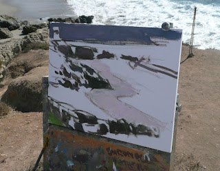
| The lead color of the morning ocean confines the warm specular highlights of the sun . Observe the softer edge of the wave crashing within the rock to the left. |
 |
| Even the highlights serve a compositional purpose |
 |
| Almost there. The warm highlights are the brightest element. Observe the foam of the crashing wave is not white but a shade of purple . The highlights have to stand out. |
|
|
I made that little graph with Monet in the center to illustrate a common rule regarding the colors of the sky. The zenith would tend to the a reddish ultramarine and as we approach the horizon we can see a shift in the hue. This is a simple rule but it underlines the importance of capturing the gradations of color that occur in big surfaces like the sky but also the ocean or even large areas of rock and foam.
Some examples of Ray's sketches. They are done very quickly and in some cases he divides the canvas to make even quicker sketches where he experiments with different color approaches. These are color and compostion notes that a photograph would never reveal. Looking at them it is easy to see why photographic reference is quite insufficient.
 |
| High Key, Normal View, High Saturation |
 |
| The highlights have added extra vibration by adding different color notes withing the area. |
Ray tries to avid the expected. Always seeks the organic forms and the "ins" and "outs". Bigger forms. Also avoids earth tones that tend to dull things out. Because the light changes very often sometimes he keeps t canvases handy. One in case of sunny skies, another when the clouds roll.
There is a certain "color coding" like I mentioned , every big shape is within one color mix.
