Showing posts with label watercolor. Show all posts

03 May 2018

A brief note on composition.

    The  painting below is a watercolor painted on a rainy day at Green College in UBC. The scenery in front of us, as always, a plethora of compositional choices. Painting a landscape or anything else is not taking a photograph.  Painting requires a deliberate composition choice. It might also be created by moving things around.

"Green College" 12"x16" watercolor


Choices. Faithfulness is important but composition is paramount. 

I decided to write this brief entry after reading about the School of the Hague. It is well established that in this school's attempt to recover a quickly vanishing Dutch landscape, they went out in search of quintessential Dutch scenery. Johannes Bosboom, Jacob Maris and others  tried to be as documentary accurate as possible but they had no qualms about 'embellishing' things a bit for the sake of a good painting. Going beyond what every  good figurative landscape painter does: trying to convey a mood and bringing the viewer into a moment of light and weather, they sometimes did "cut and paste", enlarge and shrink in their pictures.

Johannes Bosboom. "View of Utrecht"


It is not because Mr. Bosboom could not be almost photographic.

Johannes Bosboom. "Communion Service" 1849

Here are 4 very quick studies done before deciding on the finished framing of my watercolor. Notice I chopped the obtrusive bushes in the front. The first step is always deciding NOT to create a static painting by avoiding middle horizons and center lines. I normally decide whether I want the ground or the sky to dominate by lowering or rising the horizon line.


Lower horizon. Crop in. Building dominates.
The building can be the main subject if interesting enough. We can "zoom into it" , eliminate the structure to the right and let it be a presence. In another case, since the sky was just a light grey and the budding light green trees created a soft beautiful screen, we might want to emphasize it.. A lower horizon would make the tree's curtain the main subject.

Low horizon, emphasis of the air above and perspective.
The path had beautiful reflections and has the power to draw the viewer inwards towards a magic place. I can lift the horizon line and shove everything away from its direction.
High horizon. The path dominates.
Or you can let the building slide across and become a wall in the back with just a thin gap of escape. The grass as inviting as the path but more abstract.
High horizon, grass and  tree. Building blends with background.
In the end I chose to lift the horizon and let the focal point be "almost" in the middle, humanized by a guy with an umbrella which stands for the viewer invited into this calm rainy day.   I clear the grass area to allow for a bit of vegetable abstraction but let the path be accurate in its position. My higher horizon allows for all this play in the ground. If it was a street scene, a high horizon would allow for cars, traffic lines, pedestrians...but few clouds. The tree background in my painting is still a "destination" but it is not the dominant part, just a suggestion. Let's not forget the tree trunk with its graceful line acting as  divisor . It is a risk but I like how it tells the viewer where the ground starts. I could probably also have framed the painting with the beams o the porch where I was standing but I wanted the viewer to get a bit wet.
Choices are important because we tend to start painting the minute we wet the brush. A little forethought about composition can save a rainy morning.

30 October 2011

Frank Eber - Workshop

I decided to take a half day workshop with Frank Eber at the Art expo in Pasadena. I am quite wary of these types of workshops because they usually are just means to push some brands unto the participants. Moreover, this particular Art Expo doesn't have enough vendors and sponsors to really grant a visit and purchase art materials at a discount.
However, the name of Frank caught my eye because I had seen some of his watercolors in San Clemente Plein Air and I thought his art reminded me a bit of Alvaro Castagnet and Joseph Zbukvic. There was more of a method to his paintings though so I figure it would be interesting to check his workshop out.

Here are some examples of his artwork:


Frank Eber is sponsored by Daniel Smith watercolors. Here is the palette he was sponsored with. 


Frank Eber watercolors are moody and crisp. 


So here is his setup. A simple table easel. A metal palette with his colors distributed between a warm zone and a cold zone. He uses Arches paper , 140 lbs. Usually half sheets.


Franks principles are few but solid. Mostly he emphasizes that TONE is the most important element by far. He quoted another artist (whose name I forget): "Colors get all the credit but tone does all the work."
In essence, color mixes do not matter as much as keeping warm and cold color temperature and thinking in terms of tone and temperature. The colors used in a painting are very few most times and Frank uses a "dominant" color throughout. 

As far as layering the watercolor, "it's about the right amount of water, the right amount of pigment, at the right moment, with the right brush." Of course that takes ages to master. The main goal is to create a mood. To that end, after creating an outline of the drawing, Frank creates a wash layer, a very simple wash with some paper white reserved for things like rooftops, windshields or people. 


Initial wash. Notice the deeper pigment in the foreground. 


 He also emphasized that, in watercolor, shapes have to be connected, literally. So as he started creating the main shapes, the color didn't stop at "things", buildings, people, cars, but created their shapes as he painted schematic shapes and textures as connected shapes.

This workshop in particular was about painting an urban landscape so he distributed his big blocks of building masses first , using thicker pigment for the closest structures, being mindful of the areas and edges we had reserved. 

My attempt at a wash.


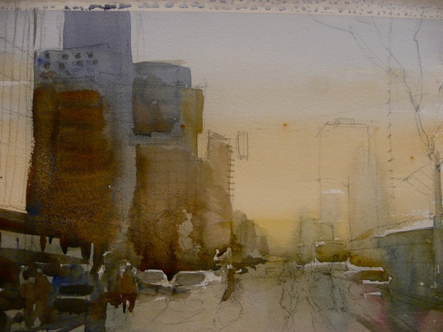
Connected shapes and big shape washes. Observe the density of pigment at the base of the buildings and the connected shapes of the cars and buildings.

The watercolor process was really quick in itself . Frank let the car, tree and people details for the very end, carefully delineating their shapes sometimes, "messing them up"   a bit others by creating water splatters or dragging the brush to generate interesting designs. . It is easy to see in his watercolor that the roughly textured paper leaves some sparkle and allows for interesting dry brush work. He also taught us some tricks regarding car , people and building rendering. 

Frank Eber's finalized demo piece.