22 August 2012

Arts District Weeks

My friend and artist Alex Schaefer invited me to paint for a show in the District Art Gallery in downtown L.A. The director of the gallery , Johnathan Jerald has been a pioneer and a prophet in the renaissance this area of the city has been experiencing. I didn't know much about the place  so I set to work in a few pieces that I thought would reflect the  mixture of old and new taking place in the district. Initially I did three pieces and then kept on working as more and more subject matter became apparent.

"6th avenue. Golden hour" 11"x14" sold
The opening of the show was quite successful as I sold my three pieces and got lots of good feedback .... what are the odds?  I needed something like this after my dismal sales at Newport Beach. You just never know I guess, different crowd and different sensibilities.  The show is still up through August till Sept 30th and the other artists made some amazing pieces as well. They are Alex Schaefer , Catherine Kaleel, Christian Hernandez, John Kilduff, Jennifer Korsen,  Arpi Krikorian, Rikki Niehaus, Teod Tomlison  and photographer Alan Reyes.

"Moped speed" 9"x12" Painted at 6th and Mateo. sold
"6th ave. Viaduct" 10"x8" sold
  Johnathan asked me to keep painting away and even negotiated a couple of commissions. I did as told because the neighborhood lends itself to it. Plus there are some nice cafes and coffee shops popping up everywhere so it's not like I was in an industrial wasteland.  It was hot however so I had to pace myself. 

"Boarded up" Citizen's Warehouse bldng back. 9"x12" sold

"Skater's alley" Citizen's Warehouse Bldng. 9"x12" avail.


The first commission  was very free flowing in that I could choose the vantage point within a particular area of the Barker Lofts. The client is a photographer so she insisted on maximum freedom. I chose a view from the terrace looking down because the glint of the old railroad tracks was just to juicy to resist. Roofs and roads really "sing" in the evening.  The Urth cafe turns out is a brand new building.

"Old rails"  9"x12" from Barker Lofts looking down on Urth Cafe.

The second commission was to paint my interpretation of the Factory Lofts. This building consists of two very distinct structures. So the challenge was to find the time of day and vantage point that would portray them better. The painting is going to the owner of this development so I felt  it was important to give an overall view and include as much as possible,  a painting that the owner of a property can look at and say, " that's mine and it's pretty."  Because it was a difficult assignment I ended up doing four pieces at different times and pov's for the client to choose  one. Probably not the way I would go in the future but  who knows, may be they choose to buy them as a cuadriptych for a bit more ? 


Here are the different views from the Factory lofts  in a row. 


"Smoker's Alley" 12"x9"

"Delivery Man" 12"x9" morning
"From the electrician's ladder" 12"x9"
"AC hum" 12"x9" sunset

01 August 2012

Just Plein Fun. My week in Balboa Island


I was very excited to be invited as a participant in this event organized by the Debra Huse gallery in Newport Beach. Specially because this year I had cancelled all plein air events in order to focus on my solo show at Segil Gallery in Monrovia. April 2013 everyone! . A week painting in Balboa Island sounded too wonderful to pass. The subject matter is so plentiful I had to take hydrating and nap breaks. Children playing in the sand, boats and quaint-till-you-faint gardens and cottages. True, it is all a bit "prettified" and very very one percent and mostly blond but you can't argue with children playing in the beach, just can't.

While on the beach walkway one of the older kids offered me 2$ for a painting. He had a know-it-all sneer. I didn't budge, I said 400$. He retorted "good luck finding somebody that pays you that." ha ha. Funny smartalec. Good luck is right (sigh). I wonder how much his dad makes...anyway... sailboats, can't deny their beauty either.

Here are most, not all, of the paintings I did  during the week. I did an average of two a day. I tried to capture every subject and mood. Not sure if that was a  good thing but I am not going to argue with my impulse.

"Garden Island" 11"x14"

"Molten Hour" 8"x10"
   "Molten hour" was a tonal experiment. It turned out pretty nice and I might try pushing the tones more in the future.
"Dredging the bay" 11"x14"
Once an urban painter, always attracted to industrial stuff. The dredging machine was a wonder to observe and always in contrasts to the peaceful beach. What first appealed to me was the smoke coming out of the exhaust. A very impressionist theme.
"Closing time" watercolor sketch
 
"Window Sailing" 10"x8"
"Closing time" is a nocturnal watercolor sketch I did on the "Fun Zone" by the ferry docks. It wasn't added to the show but I dig it enough to make it part of the collection. The painting. "Window sailing" is completely hinging on that model boat I way in the window in the morning sun.

"The collaborators" 11"x14

 "The collaborators" is an attempt at taking mental snapshots of kids playing. I scrubbed as many figures as ended up on the canvas. I am extremely happy with the immediacy of the  result.  I was a bit influenced by a Hinkle show at the Laguna art Museum. I took a small trip to visit it during the week.

 "Sand Serpent" was an attempt at capturing kids building a sand castle in the shape of a serpent during a competition. I didn't finish it more on purpose. I liked leaving it suggested.

"Caffeinated" is a quick morning study of the main street Starbucks' (on Marine) in Balboa Island. I like its energy.

"Beauty is where you find it" The construction workers on the Grand canal were painted from exactly the same point where I painted "Lucky enough(to live here)" I just turned around and started a new painting. It's one of my favorites in this looser, more figure oriented style that took over me. 

"Sand Serpent. 8"x10"
"Caffeinated" 10"x8"
"Beauty is where you find it" 9"x12"
 

"Lucky enough" 12"x9"

20 July 2012

Caravaggio: A Life Sacred and ProfaneCaravaggio: A Life Sacred and Profane by Andrew Graham-Dixon
My rating: 5 of 5 stars

Splendid book about a painter whose life was as wrapped in violence as it has been shrouded by conjecture. Some recent discoveries and archive dredging have filled some gaps and Graham-Dixon does a good job at dissecting through document comparison and research. Still, most of Carvaggio's life remains a mystery.
The main idea of the book is how Carvaggio embraced a vision that became so original and counter to norm that his influence was felt all throughout Europe for centuries to come , from Velazquez to Rubens and beyond. Mostly self taught even thought he did try his hand at apprenticing with the Cesari atelier in Rome and others, working in precarious conditions most of his life in different rented and borrowed studios, fleeing from both justice and clients anxious to secure his services, it is astonishing he painted as much as he did considering it was said that "a week in his studio meant a month in the streets".

His paintings are a product of many influences, very few of them "artistic", at least not from his contemporaries. He was in tune with the Counter Reform , specially the brand promoted by Carlo Borromeo, bishop of Milan, with its emphasis on the plight of the poor and the common people. Even when this ideal fell out of style in the Church, Carvaggio never abandoned it and made but few concessions to those that wanted wafts of cherubs in clouds and pretty madonnas. The author also mentions the impact the Sacro Monte di Varallo might have had in his formative years. The Sacro Monte was a set of sculptural groups distributed around some hills. Built to educate the illiterate masses, these scenes contain vivid colors and often gruesome details. The streets of Rome and the underworld provided both the models and settings for his painitngs. And from time to time, Carvaggio would look over the shoulder to the other Michelangelo, Buonarrotti.

His first works done for Cardinal del Monte are charged with a strange sensuality and clumsiness but they prefigure the corporeal weight that would both scandalize and tantalize his contemporaries. His only still life, a basket of fruit, basically contains every element of genius that would launch his career. The fruit is not only masterfully rendered but it is plump, damaged and overripe.

As his work matures, he sets to depict his subjects in daring compositions and a lighting scheme that would become his signature. Flashes of light penetrate the scenes, biblical or saintly , but mostly scenes that could have been plucked out of the strife filled streets of Rome in some cases. The "Calling of Sat Mathew" and the "Conversion of St Paul" in St Luigi dei Francesi in Rome became a sudden sensation on both counts of bringing daily life to biblical subjects and daring almost brutal composition.

The shifty but almost conclusive fact that Caravaggio might have been a pimp and was most likely sexually attracted to adolescent boys explains why some of the models used for his cupids and for his saintly women were indeed prostitutes and catamites. Even the Virgin herself would be modeled after one of the whores that kept him company. He rarely idealized his subjects, they all have their wrinkles, sun burnt skin, dirty feet and torn clothes. It is no wonder he saw much rejection and mockery of his artwork based on this elements. Not to worry, every rejection was accompanied with a race to secure the rejected masterpiece for one or another connoisseur. None other than Rubens lobbied heavily to have "The Death of the Virgin" brought to Antwerp and even had a special container built for the transport. Moreover, the artists that mocked him set to frantically try to imitate his style in droves.

And then there's the many crimes, brawls, wounds, punishments and pardons involving everyone from the street gangs all the way to the Pope. One painting after another were made to pay debts, escape death or obtain grace as if painting was a race for survival. These imbroglios are also well documented in this book. The author minces no words, Caravaggio was a conflicted man, a self-saboteur in many ways. He sought redemption and even the prestige of the Order of Malta just to loose it all shortly after miraculously obtaining it. He had a high concept of himself but debased himself with gusto. That someone as capable of the keenest and most vivid understanding of the miraculous could leave this trail of destruction is may be the most baffling idea, or may be it was the reason for the shunning of conventions all along. His last years in Malta, Naples and his death in Porto Ercole should be made into a movie. The book does a very competent job at following Michel Angelo Merisi di Carvaggio through his 38 short years of life. In any case, it makes this book a very compelling read.


View all my reviews

27 June 2012

Joshua Been's book

Painter Joshua been, who I had the pleasure of meeting in San Luis Obispo (CA) and Telluride (CO) a couple of times has written a small but condensed book about Painting, mostly about painting in plein air. Joshua is a very talented painter and I did receive my copy of his book yesterday. I am grateful Joshua wrote this little book and think I might use it as a primer if I ever , or rather, when I teach a workshop again. I think it was generous of him because  Joshua really tried to condense most of his experience and techniques in a way that was accessible and detailed.

"Vertical Country" 48"x 60" oil on canvas
I do not obtain any benefit whatsoever from advertising Been's book but I think people might find it answers quite a few questions regarding painting and at the very least it reveals the methods of working artist.

Dog Show

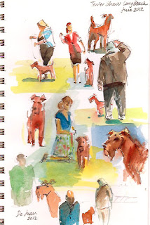
A friend of mine is a big dog (smooth terrier) lover and aficionado. She invited me to a Dog Show in Long Beach. I am always for visiting harbors and I figured I could paint the Queen Mary or the beautiful forest of cranes and harbor machinery. Once I got there I was immediately drawn to the quirky ambiance and specially to the dogs. So with the Queen Mary behind me looking massive but uninteresting I set up to sketch the dog show instead.

Here are my sketches of the "Wire Terrier" breed segment. A lady bought the sketch off my notebook for 30$. (hey, parking and a new notebook right?).  I think it was the most succesful page and it garnered me the most comments and "likes" on facebook  I've ever had  . Who knew?

The Smooth terrier, Wire Terrier segment

 So I continued sketching away and making lots of new friends in the process. I sketched the irish terriers (along with their handlers and judges). I also jumped around and trying to capture gesture and shape with a maximum economy of gesture and trying to make the pages look interesting by themselves. No lack of models for sure. 
 

Irish Terriers.

Scotties and other breeds.

 A especial page dedicated to my friend Mary Lynn and her dogs Mimi and Cracker.  I gave the page to her even though I don't like tearing them. After all, she made the invitation and I am glad I shwed up. Sometimes immersing oneself in an environment one knows nothing about  (race horses, the military, factories ..I can think of a million) is a great source of inspiration.

Mary Lynn and her smooth terriers and friend.

16 June 2012

Edgar Payne show at PMCA

I rushed today in 15 minutes through the magnificent show of Edgar Payne , The Scenic Journey at the Pasadena Museum of California Art. It is unfortunate photographing was not allowed. The show was divided by thematic matter: The Sierra Nevada of California occupies the largest surface followed closely by boat paintings from France and Italy. I thing Edgar Payne might have  enjoyed the Sierra Nevada more than the boats which I feel he saw more of a compositional challenge even though they are superbly rendered as well.  Other subjects encompass California scenes from Laguna (mostly of crashing waves), the Foothills of the San Gabriel Mountains (sycamores, eucalyptus and such) to the The Navajo country (big vertical rock walls and nomadic natives)  and the Southwest and European landmarks (boats, castles and the Alps).

"Breton Tuna boats, Concarneau, France" 1924
A few things jump immediately at the viewer. First, the size. These are large paintings. As a matter of fact, one must take a six or seven  steps away to see some of them start to come together. Especially mountain scenes. I haven't seen many contemporary painters that require that much distance to congeal.. One can almost feel the weight of impressionism on the painters of this period. The second thing that jumps at you is the thick, deliberate and BIG brushstrokes, not a lot of finely wedged strokes and carvings, just big bold strokes and an interesting but effective  "weave" of colors. Payne uses  brushstrokes  of clean color juxtaposed with others equally  clean  strokes of thick impasto. The sum becomes the final color....at a distance. Payne must have had a large studio to practice this pointillist technique.

There is a third  item that soon becomes apparent, his compositions are very correct but a  bit similar. He wrote a great book called "Composition of Outdoor Painting" in 1941 so he was very deliberate in his choices but one wonders if he felt bound by the same grammar  he taught in all  his pieces. There are very few awkward  croppings or what I hesitate  to call "modern"  framing of scenes and they seem to be limited to the boat scenes. The mountains scenes are by the book and so are most other of the sublime landscapes.

If you go to the exhibition, one should not miss the drawings, photographs and compositional studies he made. they are superb, secure and one can see the seed of every large canvas in them. It's pretty amazing he was two years younger than Picasso. I throw that in there for perspective.

"Hills of Altadena 1917-1919


Undoubtedly, Edgar Payne is a "painter's painter", bold, fast and with a keen sense of color and balance. He seems to have "played it safe" a bit but the result is astounding and the brush work would contradict that very statement.

I specially loved one of the paintings of the Matterhorn at sunset. The picture I add here doesn't do it justice at all but you know the drill ...no photos. However, there is a beautifully illustrated catalog for sale I would buy if I had any space left at all in my  apartment.


12 May 2012

Some nice paintings at the Huntington.

Here are some pictures from artist that were successful at the San Marino Art league show.
I am adding this unsold pieces because I think they are very nice within their styles. I apologize for not knowing every author. If you know who they belong to, let me know. 


Not my cup of tea but very well executed. Do you know who painted it?I guess I should check the artists' list and see if a name rings a bell.

Chuck Kovacic. "Expression of Spring"

John Budicin. Very interesting use of a dominant green.

John Budicin.

Michael Obermeyer. "Huntington Fountain"

Michael Obermeyer.