 |
| "Vertical Country" 48"x 60" oil on canvas |
27 June 2012
Joshua Been's book
Painter Joshua been, who I had the pleasure of meeting in San Luis Obispo (CA) and Telluride (CO) a couple of times has written a small but condensed book about Painting, mostly about painting in plein air. Joshua is a very talented painter and I did receive my copy of his book yesterday. I am grateful Joshua wrote this little book and think I might use it as a primer if I ever , or rather, when I teach a workshop again. I think it was generous of him because Joshua really tried to condense most of his experience and techniques in a way that was accessible and detailed.
I do not obtain any benefit whatsoever from advertising Been's book but I think people might find it answers quite a few questions regarding painting and at the very least it reveals the methods of working artist.

Dog Show
A friend of mine is a big dog (smooth terrier) lover and aficionado. She invited me to a Dog Show in Long Beach. I am always for visiting harbors and I figured I could paint the Queen Mary or the beautiful forest of cranes and harbor machinery. Once I got there I was immediately drawn to the quirky ambiance and specially to the dogs. So with the Queen Mary behind me looking massive but uninteresting I set up to sketch the dog show instead.
Here are my sketches of the "Wire Terrier" breed segment. A lady bought the sketch off my notebook for 30$. (hey, parking and a new notebook right?). I think it was the most succesful page and it garnered me the most comments and "likes" on facebook I've ever had . Who knew?
A especial page dedicated to my friend Mary Lynn and her dogs Mimi and Cracker. I gave the page to her even though I don't like tearing them. After all, she made the invitation and I am glad I shwed up. Sometimes immersing oneself in an environment one knows nothing about (race horses, the military, factories ..I can think of a million) is a great source of inspiration.
Here are my sketches of the "Wire Terrier" breed segment. A lady bought the sketch off my notebook for 30$. (hey, parking and a new notebook right?). I think it was the most succesful page and it garnered me the most comments and "likes" on facebook I've ever had . Who knew?
 |
| The Smooth terrier, Wire Terrier segment |
So I continued sketching away and making lots of new friends in the process. I sketched the irish terriers (along with their handlers and judges). I also jumped around and trying to capture gesture and shape with a maximum economy of gesture and trying to make the pages look interesting by themselves. No lack of models for sure.
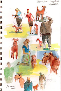 |
| Irish Terriers. |
 |
| Scotties and other breeds. |
A especial page dedicated to my friend Mary Lynn and her dogs Mimi and Cracker. I gave the page to her even though I don't like tearing them. After all, she made the invitation and I am glad I shwed up. Sometimes immersing oneself in an environment one knows nothing about (race horses, the military, factories ..I can think of a million) is a great source of inspiration.
 |
| Mary Lynn and her smooth terriers and friend. |
16 June 2012
Edgar Payne show at PMCA
I rushed today in 15 minutes through the magnificent show of Edgar Payne , The Scenic Journey at the Pasadena Museum of California Art. It is unfortunate photographing was not allowed. The show was divided by thematic matter: The Sierra Nevada of California occupies the largest surface followed closely by boat paintings from France and Italy. I thing Edgar Payne might have enjoyed the Sierra Nevada more than the boats which I feel he saw more of a compositional challenge even though they are superbly rendered as well. Other subjects encompass California scenes from Laguna (mostly of crashing waves), the Foothills of the San Gabriel Mountains (sycamores, eucalyptus and such) to the The Navajo country (big vertical rock walls and nomadic natives) and the Southwest and European landmarks (boats, castles and the Alps).
A few things jump immediately at the viewer. First, the size. These are large paintings. As a matter of fact, one must take a six or seven steps away to see some of them start to come together. Especially mountain scenes. I haven't seen many contemporary painters that require that much distance to congeal.. One can almost feel the weight of impressionism on the painters of this period. The second thing that jumps at you is the thick, deliberate and BIG brushstrokes, not a lot of finely wedged strokes and carvings, just big bold strokes and an interesting but effective "weave" of colors. Payne uses brushstrokes of clean color juxtaposed with others equally clean strokes of thick impasto. The sum becomes the final color....at a distance. Payne must have had a large studio to practice this pointillist technique.
There is a third item that soon becomes apparent, his compositions are very correct but a bit similar. He wrote a great book called "Composition of Outdoor Painting" in 1941 so he was very deliberate in his choices but one wonders if he felt bound by the same grammar he taught in all his pieces. There are very few awkward croppings or what I hesitate to call "modern" framing of scenes and they seem to be limited to the boat scenes. The mountains scenes are by the book and so are most other of the sublime landscapes.
If you go to the exhibition, one should not miss the drawings, photographs and compositional studies he made. they are superb, secure and one can see the seed of every large canvas in them. It's pretty amazing he was two years younger than Picasso. I throw that in there for perspective.
Undoubtedly, Edgar Payne is a "painter's painter", bold, fast and with a keen sense of color and balance. He seems to have "played it safe" a bit but the result is astounding and the brush work would contradict that very statement.
I specially loved one of the paintings of the Matterhorn at sunset. The picture I add here doesn't do it justice at all but you know the drill ...no photos. However, there is a beautifully illustrated catalog for sale I would buy if I had any space left at all in my apartment.

 |
| "Breton Tuna boats, Concarneau, France" 1924 |
There is a third item that soon becomes apparent, his compositions are very correct but a bit similar. He wrote a great book called "Composition of Outdoor Painting" in 1941 so he was very deliberate in his choices but one wonders if he felt bound by the same grammar he taught in all his pieces. There are very few awkward croppings or what I hesitate to call "modern" framing of scenes and they seem to be limited to the boat scenes. The mountains scenes are by the book and so are most other of the sublime landscapes.
If you go to the exhibition, one should not miss the drawings, photographs and compositional studies he made. they are superb, secure and one can see the seed of every large canvas in them. It's pretty amazing he was two years younger than Picasso. I throw that in there for perspective.
 | |
| "Hills of Altadena 1917-1919 |
Undoubtedly, Edgar Payne is a "painter's painter", bold, fast and with a keen sense of color and balance. He seems to have "played it safe" a bit but the result is astounding and the brush work would contradict that very statement.
I specially loved one of the paintings of the Matterhorn at sunset. The picture I add here doesn't do it justice at all but you know the drill ...no photos. However, there is a beautifully illustrated catalog for sale I would buy if I had any space left at all in my apartment.
12 May 2012
Some nice paintings at the Huntington.
Here are some pictures from artist that were successful at the San Marino Art league show.
I am adding this unsold pieces because I think they are very nice within their styles. I apologize for not knowing every author. If you know who they belong to, let me know.
 |
| Not my cup of tea but very well executed. Do you know who painted it?I guess I should check the artists' list and see if a name rings a bell. |
 |
| Chuck Kovacic. "Expression of Spring" |
 |
| John Budicin. Very interesting use of a dominant green. |
 |
| John Budicin. |
 |
| Michael Obermeyer. "Huntington Fountain" |
 |
| Michael Obermeyer. |
06 May 2012
The Tao of Art.
I've been reading a bit lately on Wittgenstein, my favorite philosopher, and Taoism. Of all things.
How does this relate to painting....not sure. But it seems Western philosophy has a harder time
explaining art making than Eastern currents of thought.
I was struck by some of the things in the Daodejing, the main text of Taoism. Especially in regards to emptiness and the goal of nothingness. I read it as "the space between things" or "leaving a lot of white (in watercolors)." And working so hard at your art it becomes like breathing, second nature, doing "nothing."
There is this tale of the man who travels in a cart. He is deeply drunk so when his cart has a horrible accident, he is projected out .But his stupor is so deep and his unconsciousness so total that he doesn't break a bone due to the absolute flexibility of his relaxed body. It seems the "way" of the sage would be to manifest such a flexible estate in everyday situations....and art making. Don't we create best when in a estate of unconsciousness, doing nothing?
Ah, but doing "nothing" is only possible through understanding our nature and the nature of things, without fighting them or striving. And the only way to achieve that involves such discipline as could only be mustered by few. Paradoxes abound in Taoism. What you do very well you require little effort to do, but doing it well is through intense work and a natural talent.
Western art is full of effort, visible strain. Western philosophy involves a great deal of revision and criticism, a constant rewriting and reflection over the past. Its ideal is the progress through improvement and revision of the previous states. The facility of Titian, Velazquez or Rembrandt is the product of achieving excellence in very much the same way asian art does while at the same time aspiring to differ from the previous iterations and concepts of art.
How does this relate to painting....not sure. But it seems Western philosophy has a harder time
explaining art making than Eastern currents of thought.
I was struck by some of the things in the Daodejing, the main text of Taoism. Especially in regards to emptiness and the goal of nothingness. I read it as "the space between things" or "leaving a lot of white (in watercolors)." And working so hard at your art it becomes like breathing, second nature, doing "nothing."
 |
| Nothing to do with Taoism. |
There is this tale of the man who travels in a cart. He is deeply drunk so when his cart has a horrible accident, he is projected out .But his stupor is so deep and his unconsciousness so total that he doesn't break a bone due to the absolute flexibility of his relaxed body. It seems the "way" of the sage would be to manifest such a flexible estate in everyday situations....and art making. Don't we create best when in a estate of unconsciousness, doing nothing?
Ah, but doing "nothing" is only possible through understanding our nature and the nature of things, without fighting them or striving. And the only way to achieve that involves such discipline as could only be mustered by few. Paradoxes abound in Taoism. What you do very well you require little effort to do, but doing it well is through intense work and a natural talent.
Western art is full of effort, visible strain. Western philosophy involves a great deal of revision and criticism, a constant rewriting and reflection over the past. Its ideal is the progress through improvement and revision of the previous states. The facility of Titian, Velazquez or Rembrandt is the product of achieving excellence in very much the same way asian art does while at the same time aspiring to differ from the previous iterations and concepts of art.
05 May 2012
Show targeting. Venue matters.
Art Matters is an art show and fundraiser organized by the San Marino Art League at the Huntington Gardens . Last night I attended it and showed my artwork. It was the first time I was juried in . I wasn't sure what to expect so I was a bit surprised when I found out it was quite the swanky affair. Very good artists and art and lots of collectors.
Which brings me to the point of this post. It is hard sometimes to gauge what kind of art to present to different shows. Shows have "personalities"so to speak.
Naturally you always want to sell whatever you hang in a show and be proud of what you present no matter what the venue is. However, when I don't have all the facts, it is hard for me to decide on subject matter, size, even framing and price. For example, I was surprised to discover during Telluride Plein Air that most paintings sold at that event were not of the mountains or birches but of the actual town.
So now that I actually entered Art Matters! I have much better idea of what kind of art to enter next time. Below two examples of pieces perfectly suited for this show -and many others- that Michael Obermeyer piece is splendid. This was a classy affair for a discerning moneyed public slanted to the conservative. It was a knowledgeable crowd that likes images of recognizable subject matter. The gallery itself was visually challenging with the lattice and the hanging by volunteers. So you are better off with bigger sizes and simplicity of design. Detail can be lost or crowded out. What I would not recommend is "paint for a show" but when you have several options, it really helps to know your venue.
Ok, so even if you don't sell anything the first time, it is invaluable to attend and have fun -after all, you were juried in- and pay attention to what flies off the walls. Crossing my fingers for tomorrows open-to-the-public showing.
Which brings me to the point of this post. It is hard sometimes to gauge what kind of art to present to different shows. Shows have "personalities"so to speak.
Naturally you always want to sell whatever you hang in a show and be proud of what you present no matter what the venue is. However, when I don't have all the facts, it is hard for me to decide on subject matter, size, even framing and price. For example, I was surprised to discover during Telluride Plein Air that most paintings sold at that event were not of the mountains or birches but of the actual town.
 |
| Art Matters. Cocktails. |
 |
| Art Matters. Dinner at the Huntington gardens. |
 |
| Art Matters. Gallery. |
So now that I actually entered Art Matters! I have much better idea of what kind of art to enter next time. Below two examples of pieces perfectly suited for this show -and many others- that Michael Obermeyer piece is splendid. This was a classy affair for a discerning moneyed public slanted to the conservative. It was a knowledgeable crowd that likes images of recognizable subject matter. The gallery itself was visually challenging with the lattice and the hanging by volunteers. So you are better off with bigger sizes and simplicity of design. Detail can be lost or crowded out. What I would not recommend is "paint for a show" but when you have several options, it really helps to know your venue.
Ok, so even if you don't sell anything the first time, it is invaluable to attend and have fun -after all, you were juried in- and pay attention to what flies off the walls. Crossing my fingers for tomorrows open-to-the-public showing.
 |
| Art Matters. Michael Obermeyer piece. Now. That's a "little gem". |
 | |
| Debra Holaday expertly showing her pieces. |
02 May 2012
"Rembrandt, the painter at work". A review

Beautifully illustrated (and quite heavy) book. Not a light read either. It is a rarity among art books in that it focuses primarily in the habits, techniques and studio inner workings of a famous artist instead of the usual historical or symbolic context of the art.
This book is exhaustively thorough in its research of studio practices, apprenticeships, preliminary works on tablet, supports, palette, binding materials and painterly technique of Dutch art in the Seventeenth Century in general and Rembrandt in particular without omitting possible influences and comparisons.
The book seems mostly aimed at restoration experts even though the chemistry and scientific lingo is reduced to a minimum with some serious omissions like the chemical nature of Rembrandt's pigments for example which are mostly mentioned by their common name and period nomenclature but rarely reduced to their chemical origin.
A working painter will surely find the chapters on binding, imprimatura and color palette very interesting as well as the evolution of Rembrandt's style from a tight style in stages to a "pittura macchiatta" influenced possibly by Titian or a byproduct of the artists' lengthy experience. I think the last 4 or 5 chapters should be required reading for anybody that is a Rembrandt admirer. I found that the information about the size of a palette and how colors had to be mixed by assistants to tackle specific passages for the day really enhanced my understanding of what amount of planning and expense was required back in the time. It also made me understand better the reduction to tone and brush mastery , the unity and volume of Rembrandt's technique as he became older and more parsimonious.
The main "thesis" of the book in my opinion is debunking the merely visual attempts made by many to elucidate the alchemy behind Rembrandt's mysterious technique. Starting with painter Josefz Israelis muddled interpretation of the master's beautiful palette and "houding" = (I understood this to mean a masterful unity in color and composition , what makes a painting come together form a distance).Israelis work just looks muddy, not particularly compelling in my opinion. The underlying quality of Rembrandt's art owes a lot more to a clear understanding of light distribution than Israelis was willing or able to aknowledge.
Other students of Rembrandt's masterpieces include Reynolds (who attributed the lusciousness of Rembrandt's art to an abundant use of wax), a Jacques Maroger who claimed to have come close to the mysterious binding medium ( a mix of mastic, wax, lead, turpentine and other substances) and Max Doerner's, whose thesis regarding the use of glazing and resins seems to be misoriented. as proven by years of mismanaged restorations that failed to remove the color that should have been in the thin upper glazes.
 |
| "The Jewish Bride " 1667 (Rijksmuseum, Amsterdam) is one of the most analyzed paintings in the book. |
Through the use chromatography the author finds nothing but linseed oil, walnut oil and traces of egg emulsion ! in the artwork. . Moreover, through analysis of unfinished works, etchings and X-rays, the author also deduces that much of Rembrandt's work was a lot more direct than initially thought with sketching done directly in oils and local color applied fairly early on. In many ways, Rembrandt and his contemporaries owe a lot to Van Eyck, an earlier master whose breathtaking technique (like emulating textural qualities of materials through relief in the paint and light capturing volume) and splendor were probably the direct antecedent to many in the Netherlands.
I did appreciate this fabulous book despite the difficult reading and I'm sure new discoveries will come forward in time. I just wish there was a more abbreviated and lighter version and that more attention had been paid to link older and current pigments.
Subscribe to:
Posts (Atom)