13 March 2012

Quang Ho Demo (2)


Romanesque Room, Pasadena's Castle Green

Besides the interesting lecture, Mr Quang Ho also demonstrated his skill with the brush.
Sarah Streeter was the beautiful model on hand, illuminated by warm spot lights. I took a few notes of his work approach but I think, in this case, it is clear that  it is a philosophical shift that has to occur before trying to adopt his particular habits or style. 

My notebook. Quang Ho's demo
The palette he uses is pretty standard.  
A set of colors: 

-Cadmium red
-Cadmium Yellow
-Cadmium Yellow light
-Alizarin Crimson
-Ultramarine Blue
-Cobalt Blue 
-Viridian
-Sap green.

The browns get their own room: 
-Yellow Ochre
-Transparent Red Oxide
-Terra Rosa
-Burnt Umber
-Black

Brushes are the ones everyone and their mother uses :  Rosemary brushes and  also Signet brand long filbert for that "Far East" feel, they have a life of their own. I think those brushes certainly add a calligraphic quality to the strokes. 

The setup. 
I couldn't see the support. It looked like a standard primed board. Not too slick but smooth.

Quang Ho rarely uses any medium and, when he does, it is usually Liquin. He likes fluid painting so he avoids sticky thick mediums.


Quang Ho's palette.
He explained every painting starts with a concept. In this case, it was the flash of luminosity and the contrast between the edges (of the face) and the receding shapes where the edges got lost like in the hair and background. The main "idea" of the painting has to be clear before you even start. Is it about color, an interesting design, movement, etc....

He started by creating a warm greenish brown base, very loose and abstract, flying around the basic shapes of the model.  It was mostly monochrome. When he was satisfied with the placement of the stain, he started by adding the base color, the "main" color as revealed by the light, right on the face, forehead area. He didn't get into the shadows until much later. This "starting with the lights" he says is unusual on him but he apologetically said he did it "because he wanted to."

"No ears, no nose or eyes, just shapes, only then you can see how important the eyelid casting  a shadow on the pupil and the shawl providing most of the light within the cheek  and neck are...."

Very washed out picture. If someone has a better one, please send it. 


"If you make a choice of color, it's always the right choice." He said. "It's when you don't choose that things go awry". His brush work was determined, singular, no flashy scrubbing despite appearances, no  dabs, no massaging. One brush stroke at a time.

"Where the light meets the shadow, that is where most interesting effects occur." The area of transition between light and shadow is where the local color really makes an appearance. The attention to the face underscores the focal point of the painting. But he mentioned that everyone disagrees about where the focal interest of a painting lies and one shouldn't be too obsessed with trying to create one focal point. The viewer always brings a bias.

There were no details for a long while, just chiseling of shapes with the flat brush. A keen observation of big shapes and gradations of color across the shape of the face.


The  tremendous speed at which the portrait gained form was in step with the precise handling of large swatches of color . Every brush stroke contained the elements of shape, color and value. The "fun" as he called it started when he finally started leaving the face and building the clothing and hands, where the abstraction was more welcome.


About 25 minutes into it

12 March 2012

Quang Ho Demonstration


I decided to reward myself attending a demonstration by artist Quang Ho. I really didn't know much about him but I had a bit of a desire to get inspired. So I browsed some of his paintings online. Definitely a Richard Schmid pupil, I thought. Why not.

I've never been disappointed attending a demo no matter what actually happens in one. And this one was special in a different way as well. Quang Ho demonstrated his painting at the very end for about 45 minutes. But the first two hours were devoted to a very inspired philosophical lecture on art. Now, normally, had I been warned, I would have run away but seeing how I didn't know what was coming I was sitting in my chair at the Romanesque Room in Castle Green (Pasadena) when me and about a hundred other lucky people got to listen to one of the best and most profound speeches on art making I've ever heard.

Since I want to keep a record of it for myself and also share a bit of it, i am going to try and synthesize my hasty notes in here. Keep in mind, it's my version of what I heard.


Quang Ho was born in Vietnam, his father was taken from the family at an early age and he, eight siblings and his mother emigrated to the US, Denver area, sponsored by a church. His mother was a single mom. His mom died. His father turned out to be alive decades later. Quang Ho recently visited him in Vietnam and  did a series of beautiful paintings in that country. No portraits of the father. His superstitious wife says that if he paints him, he'll die soon.


In his lecture, Quang Ho started by displaying some slides of galaxies and microscopic pictures of sand. He wanted to point out that in nature, there is no repetition and yet, everything forms part of a whole. He thinks art is similar in the sense that it must be a whole and yet non repetitive. He calls this characteristic of nature "the divine specific". I love that. In nature, everything is a part of something else but is in itself complete. Later on the lecture, he would display a lot of cropped details of his paintings to demonstrate how any segment could have worked as an individual abstract piece regardless of the position of the segment on the painting.


At Quang Ho's demo


Then he told us about his definition of art: "The byproduct of our search for what is true". Wow. Hold your horses.  But if you think about it, it is pretty dead on. Then he added he also loved Joseph Campbell's definition:  "A real artist is the one who has learned to recognize and to render... the 'radiance' of all things as an epiphany or showing forth of the truth."
In other words, art is the ability to perform (technique) combined with inspiration(intention).

So the "rendering" and "performing" mean you need to know your brushes, you need to know how to draw and draw a lot, you need technical ability. The "inspiration" and "recognition" come from the intention of the artist, the exploring of the visual truth in its shapes.

OK, so far, pretty heady stuff. But he soon got to specifics. You've heard it before, it's line, color, value, edges ,textures.... Not so fast. Those are the ingredients and they need to be combined so as to enhance each other, yes. But the combination of those elements  need the artist's decision making process, the intention, so as to achieve  a maximum randomness, an avoidance of repetition. All the edges can't be just sharp or soft, degrees abound, "If you pick the painting from one corner, you shouldn't be able to just lift a piece, everything must come up with it, everything will be connected". 

Rules conflict with our search for the truth. Rules are helpful if they help us think but then you still need to squint and seek the visuall truth. What kills a painting is a lack of decision. Have you ever noticed that the more you look at an area of color, the more this area becomes larger and larger and with more color and more nuance that you can possibly paint?  Why do we struggle trying to capture all the tones and gradations on the sky? All we need is a "gentle awareness", not being bogged down by rules like "The back will always be cooler" or ""warm colors come to the front" ....  PICK a color already . The color you see. Stick with it or change it but do not fumble. If nothing else, this piece of advice should be engraved on my easel.

What we are talking about  here is learning how to see an apple as if we had never seen an apple before.  I think abandoning preconceived notions is partially what  this search for the truth implies. No labels or concepts. Just a "gentle awareness" of  what's in light, what's in shadow, what is the source of a reflected light or a cast shadow, where are the gradations of tone...What other purpose does squinting have but to remove the noise of "things" just so that we can see the whole.  A painter makes decisions. 


He told us there are really about eight different approaches or intentions. The first four have to do with the natural world.  Think of "approach" as what the painting explores.

There is the "light and shadow" approach. Things as revealed and affected by oblique  light and shadow.

Pansies
There is the local tone approach. These are paintings that actually play with a few notes of local color, no light and shadow or very little. Like during an overcast day. (Fechin, Van Gogh, Degas, Diebenkorn). When we talk about "high key", "low key" paintings, they usually fall in this category. Van Gogh was a mediocre "light and shadow" painter till he discovered his local color approach.

Frost Hill.
Also, the silhouette approach. Backlit scenes. Dan McCaw comes to mind.

Yellow Dancer 20x20
And the form or frontal light approach. Think Georgia O'Keeffe. Little modeling. Shape predominance.

Four other visual approaches are as follows:

Lines. Lines have a tremendous expressive potential. Think Toulouse Lautrec. Some people refuse to believe in lines as an expressive medium (David Leffel, for example). To each it's own.

Pattern. Specially a dark/light pattern. This is at the heart of many paintings as what we would call a grayscale  approach. A painting that is just done in black and white r brown and white or any other two tone combination.

Color. Some paintings are driven by an exploration of a pleasing color combination or harmony. The dahlias below are just a study in white and green plus an oblique light. The lady in red is clearly a masterpiece driven by the seduction of the red fabric.


One final approach Quang Ho has explored a lot is the "equalization" in which the whole painting seems to achieve a maximum randomness pattern , almost an abstraction, a total interconnectedness of the pieces. Even inside the painting SHAPES are the gel that combines this controlled randomness into a coherent total. 


Painting is about paint. It is the paint itself that creates it's own ecosystem. Nothing else. There are atmospheric painters like Quang Ho and more graphic painters like , say, Maynard Dixon. An atmospheric painter seeks to provide motion, interlacing of all the notes at his disposition, gradations of color and  values, texture and flow. 

In my next installment of Quang Ho's demo, I'll get more into his actual painting technique. 


19 February 2012

The Greater Journey.


 I recently read "The Greater Journey, Americans in Paris" by David Mc Cullough. I found it fascinating. Especially regarding the chapters that deal with art students in Paris. Here is my review of the book:


   From the year 1830 to about the 1900's  many Americans crossed the Atlantic in search of an education in France. Their objective was to improve themselves and bring back to the US the knowledge they could only then acquire in the French capital, Paris.  Politicians, doctors, writers and artists endured the trip driven by a desire to learn and expand their  horizons. In most cases, they arrived in Paris with no money, no knowledge of the language and very little idea of what they should expect. Due to the difficulty of the trip, they stayed years in Paris, worked very hard and absorbed every idea they were exposed to. Their stories are amazing and very illuminating. The result of their journey  was an elite group that really launched the US on its way to occupy its place  at the forefront of civilized nations.
    Many books have been written about the original Franco-American relations after the Revolutionary war (Jefferson, B. Franklin, etc...) . Also, most people are familiar with the 20th century iconic Americans that paid a visit to the City of Lights (Heminway, Gertrude Stein or Scott Fitzgerald.). But the period covered in McCullough's book is a little more obscure even though it is  by no means less important.  It's the time of the American Civil War and the Third Republic in France, the time of Abolitionism and the Commune. These were tumultuous times by any standard and it is simply amazing to read about the talented people that risked everything not only for personal glory but to bring back to America culture and new ideas.
    For some reason the first three chapters of this book are a bit hard to get through however. These chapters deal will writers like Fenimore Cooper and doctors like Wendell Holmes. But by chapter five I wasn't able to put it down. First, the book has a nice  way of weaving the stories of all the characters involved and follow them across time and historical events.  Secondly, the biographies of these Americans were indeed interesting, even exceptional. Who knew Morse was a very talented painter before going on to invent the telegraph for example?  That the first american female doctor graduated in Paris. Painters like George Healy, O. Tanner, Beckwith, Singer Sargent and Mary Cassatt. Sculptors like Saint-Gaudens. Politicians like Sumner  and Wishburne. The American colony in Paris grew and was tested at times by the various upheavals that shook France and the US, the Franco-Prussia war and La Commune being probably the most dramatic and violent fro the french residents but also, of course, the American Civil War.
    McCullough is a good writer in that he is able to convey not only the facts but also delves into  the difficulties, heroism,  and even moods of the people he writes about by researching their correspondence and documents. I recently read a book that would be the perfect companion to McCullough's but from the perspective of french painters: "The Judgement of Paris" . As a painter myself, I found  interesting to know that both Manet and Wishburne were both inside Paris during Bismarck's siege, that Singer Sargent and many other American painters were competing with the likes of Meissionier and the group that would eventually become the "Impressionists" for medals in the Salon. But also the conditions in which artists worked and studied in France would interest any art student today and put things in perspective as to what being an artist meant and means today.
       The statue of Liberty, the Tower Eiffel, the Smithsonian Institute , many monuments and museums  that adorn American Cities, ideas about science and politics, art collections and emblematic artworks... they all make an appearance, step down from their pedestal  and become alive , controversial and relevant once more.

04 February 2012

Deadlines as lifelines.


"Karoly's studio" watercolor.
 Sometimes the best encouragement to paint comes from setting your own deadlines. And instead of setting artificial deadlines, I find contests and show entries provide tangible and unmovable dates to abide by.
This year, I am trying  to enter as many shows as possible. I even have a  list in my wall that indicates when the different deadlines are. For example, I always miss the National Watercolor Society deadline, I think I've entered three times in ten years, but not this time.  Above, my entry for this year. I am not sure if it will be accepted or not but at least I was motivated into action.

Sure, pressure like this makes painting more of a "job". I am normally assaulted by performance doubts: I am not good enough; I might no win anything; I am not totally happy with this piece, etc, etc... But the key for me is to keep excited about the goals shows represent: Waiting for the answer. Aiming to ever more prestigious shows and trying to match the quality of the artists that flock to those shows.

Rejection hurts a bit , but it is a necessary spur. Many times, I 'know" my piece wasn't up to snuff. In other occasions, I also "know" when a piece is going to do well for me.  This "knowing" is like an inner compass of quality. Am I getting better, more confident, or am I  falling asleep at the wheel.


"Moon Gasp, Dume Cove" oil, 20"x24
Above, my entry for the California Art Club, "On Location in Malibu". This is a larger piece as dictated by the venue. No problem, I need to paint bigger. It's a subject I rarely attempt. Again, a challenge I want to tackle.  Below, my entry for the Pasadena Gallery Association. This time it's a larger painting as well and it's a figure.

"Baker Girl" oil, 24"x18"
Sometimes, venues and shows are right down my alley. Below are my entries for the Fremont Gallery in South Pasadena and The San Marino Arts League show. I am well provided of pieces for these shows so it's a no-brainer.  I must add that entering shows and contest sometimes can be distracting but I keep my "excessive entering" in check by trying to pick the best match for my art or the most convenient.
 Next up: Oil Painters of America.  I know some top notch painters enter that one.
"Busters" oil, 8"x10"

"Conversation in the Garden" oil, 12x16


14 January 2012

Trip stamps.

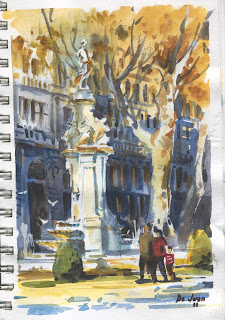
During my trip to Madrid, I mostly visited family. But I took a notebook and a watercolor box almost everywhere. So in between shops, friends and museums I took a few breaks to sit and sketch what was in front of me. Here are some of my favorites. All in watercolor.


Plaza Carlos Cambronero , Madrid

El Rio Manzanares.

Plaza de España

Catedral de Salamnca

Fuente de Apolo, Paseo del Prado

Plaza de los Chisperos.


Plaza de Olavide.
Plaza Cánovas del Castillo.

13 December 2011

The value and vice of small

I am always a bit pressed for time so small studies ( I don't like calling them "little gems")  are a must if I want to get the amount of practice I need. Drawing and painting in notebooks is a good way of not getting rusty. Recently I've been admiring sketches done by the likes of Nathan Fowkes and Mike Hernandez. Both are concept artists for Dreamworks Animation, my old employer. Their sketches sometimes are done with watercolor and gouache. 

Watercolors offer a quick way to block and simplify complex scenes in small format. The gouache comes in handy to add detail. Its opaque nature gives body to the painting. I have done small pieces in oil, in straight watercolor, in watercolor and ink, in watercolor and white gouache only, etc.... the value of the study is not in the medium used but rather in the simplification. 

"Huntington roundabout" watercolor and white gouache

These are some of the advantages and disadvantages I find in small pieces. The advantages are pretty obvious: 

1) One glance judgement. Small studies allow you to avoid getting lost in detail.  The shapes and composition , the tonal values and the color work or they don't and you can see that in the palm of your hand. 

2) Savings in time and effort. A small study can save hours in a large painting since it allows the artist to spend enough time solving problems before they rear their ugly head. 

3) Diary value. Over time, notebooks register advancement and state of mind, even improvement.

4) Options. Doing several studies at different times or different angles allow for a catalogue of choices if a final piece is desired. They also can be goals in themselves. Nobody says small studies need to end as large paintings.

5) Scope of ideas and experiments. Some things just don't grant a whole statement. A simple scene, a detail, a simple light effect...these things might grant a small study, not a more time consuming work. 


"Atlas street" oil on canvas 7"x5"

There are also disadvantages, mostly one:  I find it hard to launch into larger pieces when I know I can be "done" in two hours with an idea. Larger pieces require a preplanning, patience and discipline that is its own practice. After all, it is difficult to mess up the palette when its all used up in one session. 
The freshness of a sketch needs to translate in larger pieces but miniature practice can make one underestimate the "larger" scale  required, the use of the arm rather than the wrist so to speak. 


"Fishing pond" watercolor and gouache


14 November 2011

Jose Vera Gallery Opening. "City to a fault. Los Angeles and Environs"


Alex, me and Will Wray


Finally the day arrived fro the opening of "City to a Fault. Los Angeles painters" at Jose Vera Gallery in Eagle Rock, California. The artists involved were Oscar Arroyo, Jose De Juan, John Kilduff, Alex Schaefer and William Wray. The show was very well attended and the artwork was amazing. Alex brought one of his latest "burning bank" creations and so did I. Except mine was in the form of a cake with one of Alex's now famous banks printed of top. After all, our boy was turning 42 that very day and we wanted to surprise him. (see pic below). 
Alex conversing with Aaron Westerberg

Alex was displaying some large format plein air views of downtown L.A. His pieces showcased his usual talent to create very dimensional images with a great economy of brush strokes and little messing around. Placed alongside William Wray's loose masterpieces in bold colors and brushwork,  you had two radically different visions down a similar path. John Killduff's matter-rich urban landscapes were full of grit and gesture as well. Oscar's pieces were more contained and premeditated but he wasn't shy about subject matter or design either and given his youth, it can only get better from here.

Alex with a burnin' cake.
 All five artists attracted a fun crowd. Even Sean Cheetham and Aaron Westerberg among other famous and less famous artists stopped for a peek which was the best validation one could hope for besides a sold out show.

Sean Cheetham in front of one of Will Wray's pieces.