After reading Rob's blog -and being better acquainted with Constable's work now that I've seen the show at the Huntington in San Marino and the V&A in London today- I wanted to clarify my thoughts on this proto-impressionist's standing, oh and gush about his bravura brushstroke and thick handling.
I have to concur that Constable is not at the level of Turner but he is not that far behind despite the fact that both painters ,who were rivals in life, have been made into the poster children of the Victorian landscape. The exhibition had some pieces by contemporaries of Constable and a few were quite good but in my view Constable is deservedly lifted a bit above. He shares with Turner the romantic handling of the brush, chaotic at times, heavy handed often and almost abstract in the pursuit of movement and light.
My first gut reaction after seeing the show: there is much to love in Constable. The full size massive study for "The leaping horse" was breathtaking. Notice I said the "study". The final painting was quite bland in my opinion. In the study, the cloying impasto lends an enormous energy to the main figure of the rider that seems to be pulling away from the dark soil. The startled horse is clearly the muscular center. The sky seems a bit heavy and troweled . How much of my liking this painting is due to my biased view as a 21st century observer...i can't tell.
Jump to the finished piece and,voila, Constable has placed the willow stump smack in the middle paralyzing everything and quartering the picture. It seems he wants to open the right side to the view but I think it actually just looks oddly static and contrived all of a sudden. The river area is now a band of specks and rendered details below the bridge, a sort of "a below the ground" cut-out storage. The barge in the final work competes with the horse for attention. The sky is probably the only thing that has improved in the final piece by receding and becoming more airy.
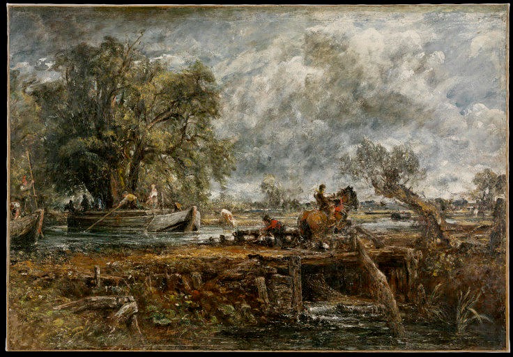 |
| "Leaping Horse", study" |
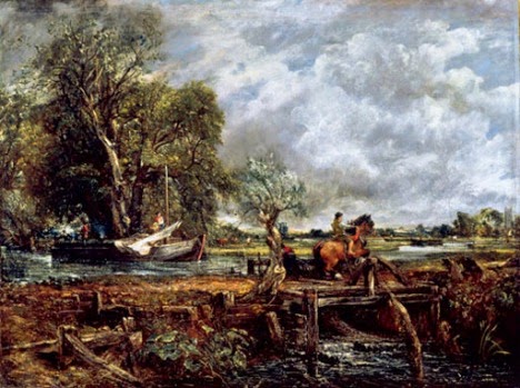 |
| "The Leaping Horse". John Constable. |
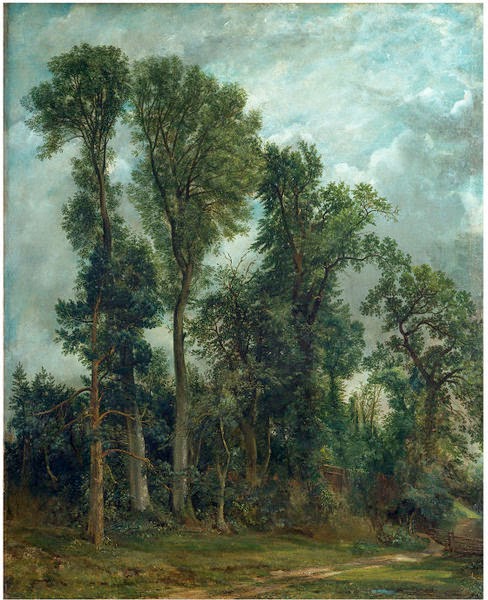
But but but, as I was saying, there is much to love in Constable. I am talking mostly about his outdoor studies. Constable was a pioneer of the outdoor sketches even though he was not the first one to attempt them. He carefully made notations about clouds and skies, kept pocket books full of drawings and generally devoted himself to capture transient moments. He did many close studies of buildings, plants, animals and man-made objects. One of my favorite studies had to be this elm trunk. In the exhibition, it was displayed between two very similar studies by Lorain and Lucien Freud.

 |
| "Study of foliage" |
His studies done in canvas shreds, wood planks and paper are really good and they show a keen appreciation for nature. However, his subject matter, unlike that of Turner's, is very limited and he is clearly uncomfortable with grander themes.
So what, if anything, would make Constable step down a few notches from the pedestal he has been placed by art historians? Well, I think he is still one of the best landscape painters of his time and I am in no position to un-seat him but he is safely dead and indifferent to my musing so here are some thoughts:
His paintings often lack focus, especially the finished ones. This is a tough one because nobody says a painting has to absolutely have a focus but Constable seemed to have a chronic need to populate every bit of landscape with figures or elements in his finished pieces. Chicken, donkey, boy, dog, chicken, peasant girl, horse, birds....oh, another chicken! nah, water hens. This creates tiny accents all across that distract and muddle the otherwise perfectly nice landscapes. He also has a strange propensity to highlight every bit which almost feels like the paintings are seen through a snowstorm of specks.
Here is a painting that is just adorable despite, or may be because of all the bits of business in it.
 | ||||
| "Cottage in the cornfields" The photo doesnt do it justice but you still can see the two butterflies, can't you? |
Here are two nice paintings . The study for "The cornfields" is lovely. The final piece is not bad either but he has added a flock of sheep, a kid getting a serious case of cholera (ok, I'm extrapolating), a dog and two women. It's starting to feel crowded and the kid seems a bit odd. In the final piece, there is so much going on around the barge with all the little "nativity figures" that it seems clear the artist is not convinced the beautiful -but somewhat technical- rendition of the boat will be sufficient to deliver the painting.
 |
| "Study for the cornfields" |
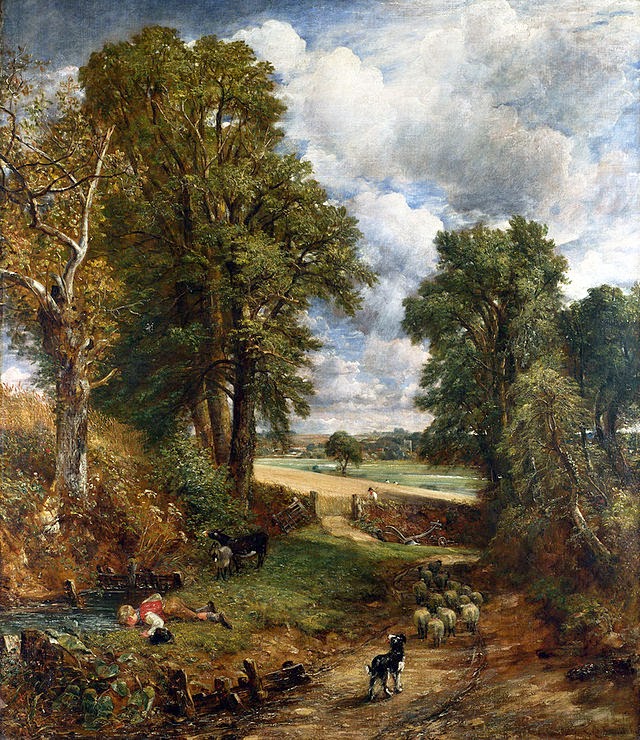 |
| "The cornfields" |
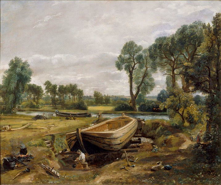 |
| "Boat Building Near Flatford Mill" |
And then there's this crazy mess...
 |
| "Opening of the Waterloo Bridge" |
Clumsy perspective. Constable didn't like perspective, I can tell. But not because he didn't care. His studies and copies of Paolo Ucello make it perfectly clear he cared. A lot of his church towers seem tilted, his ponds and rivers often "climb" beyond reason and he favors compositions that act as "open windows" and layered distant vistas over anything too architectural or layered. There are quite a lot of examples of this. He also liked to put things in the middle of his paintings, again, that is not an error per se but it makes things a bit static and just why?.
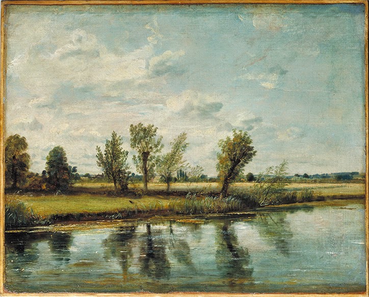
On a side note ..but somewhat related,, his tendency to mismatch reflections. I know, I know, it is not essential to be accurate but in almost every Branch Hill pond study and painting the sky light wasn't symmetrically mirrored. I know people could find physical explanations and the offset is more noticeable in some cases than others but it drove me bonkers.
 |
| "Branch Hill pond" with the sun mirrored slightly off |
Tortured compositions. Constable based many oh his compositions on Lorain, Poussin, Ruisdael and other masters he studied through his extensive collection of prints. On his own however, he either flatly reproduced what was in front of him or didn't seem to know where to place things and ended up scattering elements of equal importance all over, creating tortured compositions or placing things smack in the middle.
I cannot really comment on his sense of color since I suspect many pigments have probably faded or have been altered by time.
Here is another composition. This is a finished piece probably started in the field with the aid of a tracing frame. It basically portrays an "accurate view". It is competent, pleasant but a bit blah, almost just decorative. If it wasn't Constable, would you have stopped to look at it?
 |
| "Watermeadows near Salisbury" |
Would have been my favorite painting of the show (again, the photo is not nearly as impressive as the real thing) except for that TRIANGLE on the sky. Couldn't he at least have interrupted the straight line by chopping a few branches? The bottom of this painting was out of this world beautiful!
 |
| "The Path to Church" |
In conclusion, Constable was a great painter that seems to have certainly hit some highs and elicited a great response in the public. All masters make mistakes or produce substandard work from time to time. Should abundance of the substandard work take away from the merits of the highlights or is it the payment in the from of labor that every master must pay?
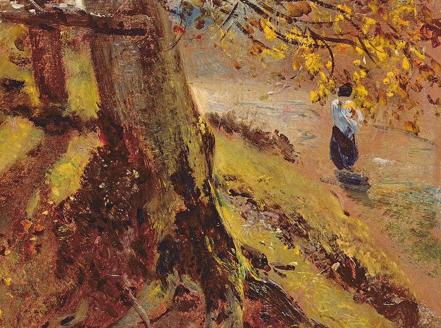 |
| Study of tree trunks. Sweet... but a bit more love in that figure? |